
MeDSeMBLY
Medsembly is the premier network bringing students and professionals together under one community.
LinkedIn for college students to help them develop their careers. Focusing on PA for now but planning to expand to other healthcare fields and ultimately a broader range of career fields.
LinkedIn for college students to help them develop their careers. Focusing on PA for now but planning to expand to other healthcare fields and ultimately a broader range of career fields.
Currently 1000+ app downloads (80% students)
Launched MVP in April 2022
3 weeks
Project Duration
UX Designer/ Lead UX Researcher
My Role
Figma, FigJam, Maze, Firebase, Slack, Zoom, Google Suit
Tools Used
- User Research
- Comparative & Competitors Analysis
- UI Design
My Responsibilities
- Information Architecture
- Prototyping
- Usability Testing
0. Overview
Medsembly founder, Rodeline, is a physician assistant, who recognized the lack of diversity in her program. During the pandemic, she discovered a demand with undergrad students and career changers for connecting with professionals/potential mentors in the field.
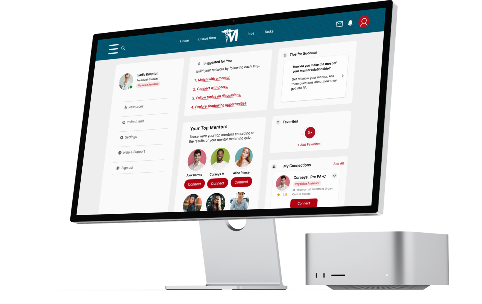
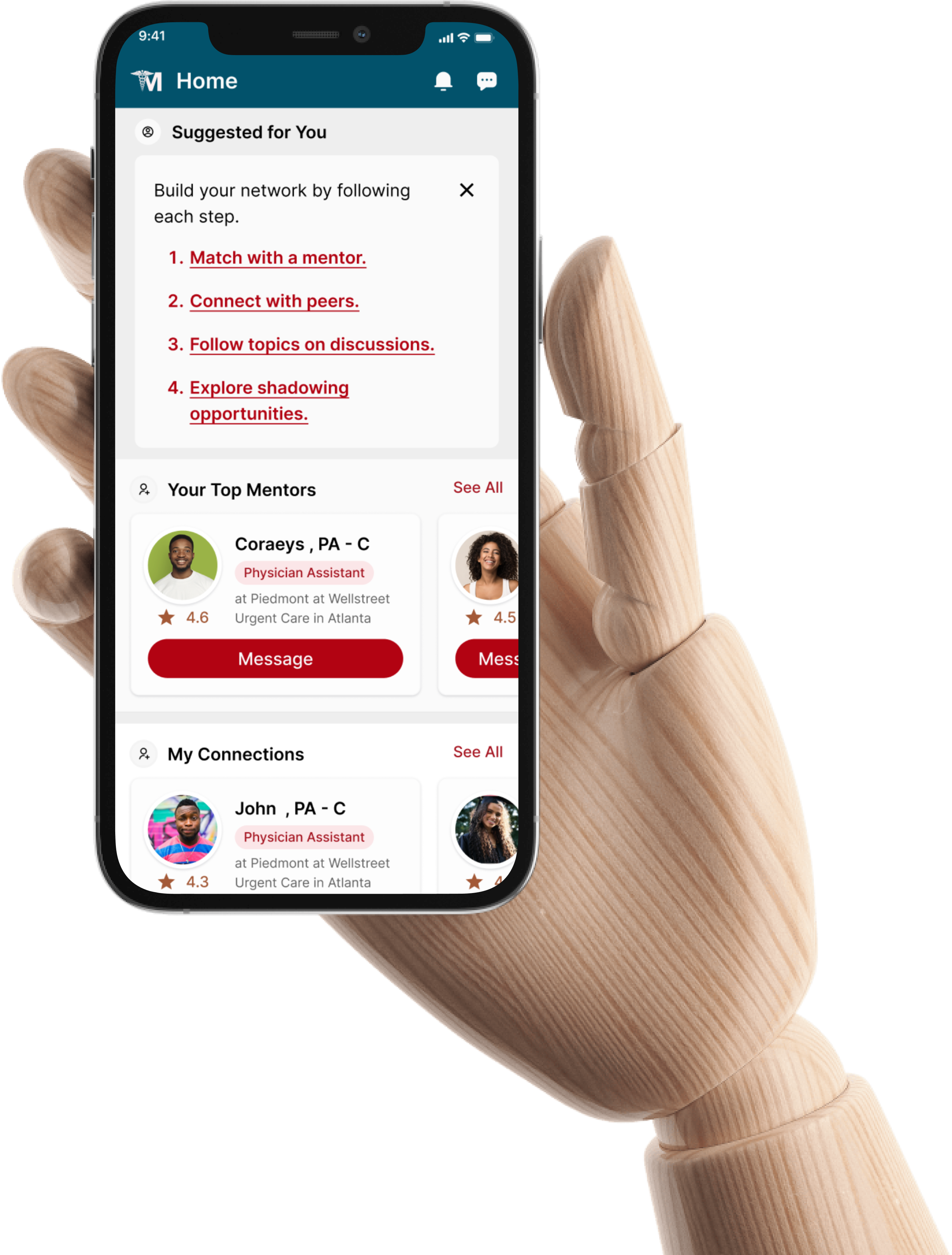
Subsequently, the idea grew into a “Linked In” - mobile application for medical college students. Right now the app is where most of the interactions happen, but users agree they’d rather use a Desktop computer for it. So the website doesn’t have feature parity with the app.
And to solve this particular problem, the client turned to our team!
Challenges
- To create a desktop website feature parity with an app.
- The website should have a separate path for healthcare recruiters for the job posting.
- To create not only a convenient website for mentors & mentees but also encourage users to reframe their thinking to focus on relationship-building.
Main Goal

=
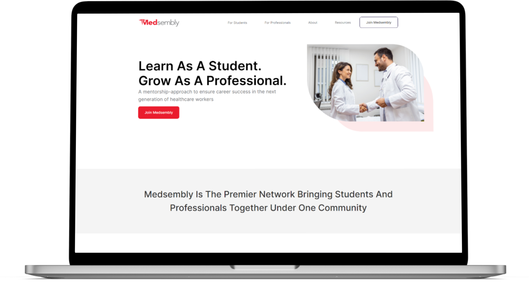
At the moment, the website can only be used to familiarize yourself with Medsembly.
There is no way to Sign Up and start building relationships.
There is no way to Sign Up and start building relationships.
The Real Issues
- Users aren’t fully completing their profiles – how might we encourage profile completion in onboarding?
- Can we evaluate the usability of student task completion – is this simple enough/efficient?
- We’re looking to streamline time commitment for mentors to be engaged on a weekly basis
- Student users don’t engage beyond tasks
1. Process
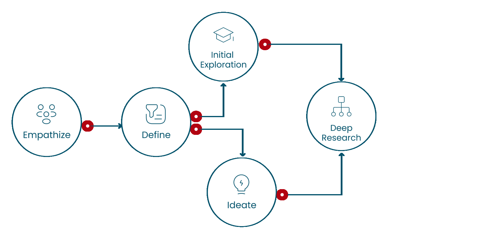
The project was a 3-week sprint where we were given time to conduct our research and prioritize our design decisions. We were a team of 4 who led the research and design process, as well as testing the app’s controversial points.
We started the project with a kick-off meeting with the founder of Medsembly, where the client's goals for their product were outlined.
We began the project with an extensive research phase. The goal of the research phase was to uncover higher-level user goals and zero in on the current user pain points and test all the controversial points of the current mobile application in order to build the website in the best possible way.
After conducting user research to best ascertain our design solutions, we met periodically with the client during the sprint to iterate on the product. The iterations were also informed by many rounds of testing to ensure that our designs and solutions would provide the best experience possible for our users.
Competitive Landscape
To understand what medical networking is and how the mentoring process works I was empowered to conduct Competitive & Comparative Analysis. This process helped us better understand the competition.
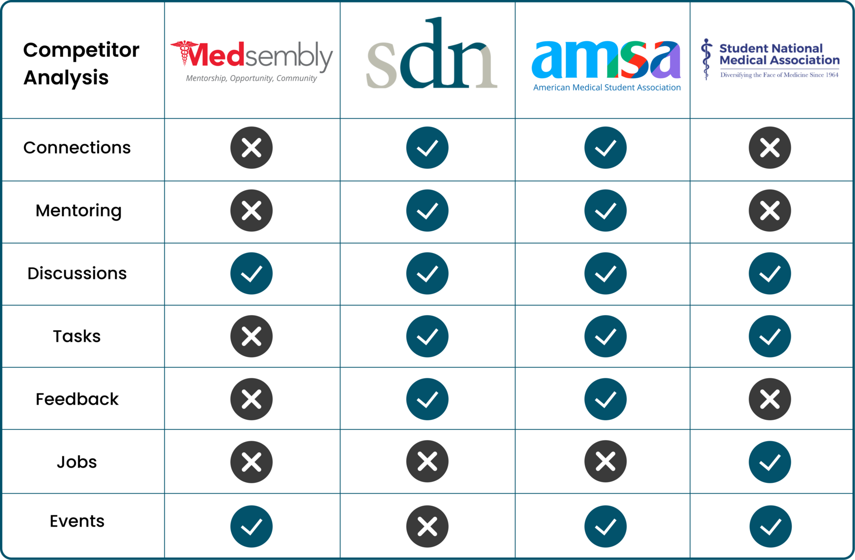
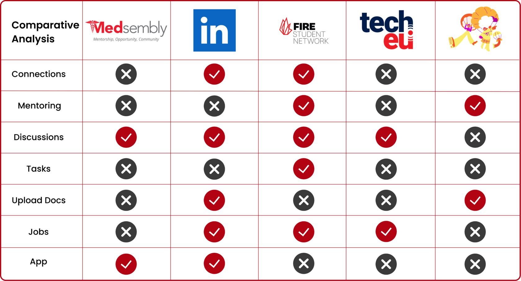
During the C & C Analysis, I identified the leaders in each comparative group in order to draw the client's attention to the leaders and identify patterns and features that the team and I later used in our design decisions.
2. User research
General Surveys
- 19 Replies
User Surveys
- 12 Replies
Affinity Mapping
- 10 Sections
We conducted survey results and created affinity map, user proto-personas, and task flows to properly empathize with the users.
Using an affinity map to synthesize the data, we were able to discover the most common user goals and frustrations. In the end, we got 10 main sections:
Using an affinity map to synthesize the data, we were able to discover the most common user goals and frustrations. In the end, we got 10 main sections:
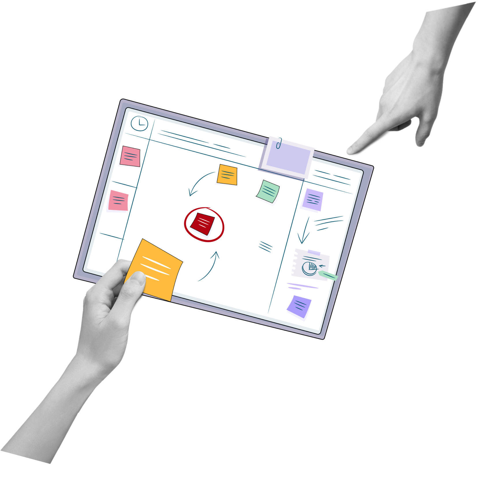
- Mentoring Relationship
- Asking a peer/mentor for advice
- Mentoring
- Connections w/other professionals
- Goals hoping to achieve by having a session
- Finding job assistance
- Tools
- Services used in school
- Platforms for Feedback
- Optional Comments
Key Findings
- MAIN REASON for finding a mentor - to overcome fear and grow confidence
- MAIN TOOLS used to interact with mentors - Google Docs and platform for video communications (Meetings)
- MAIN GOALS for using Medsembly - professional growth and networking
User Personas
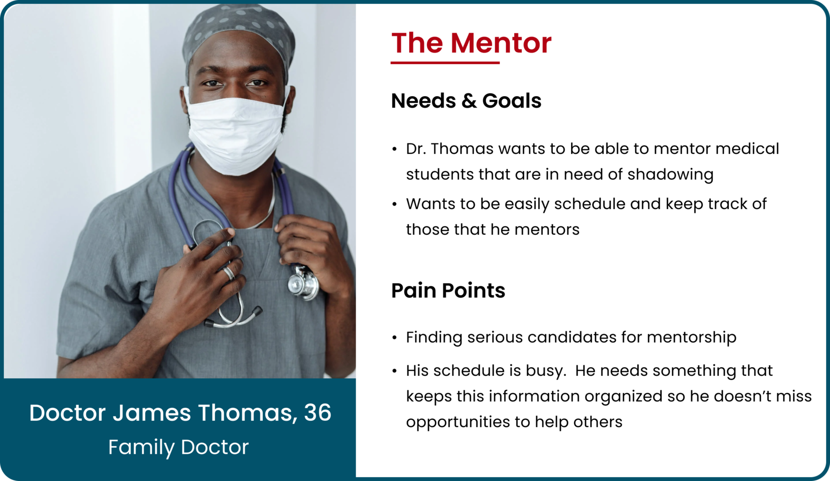
Based on all the data and key findings of the affinity map we created 3 proto-personas:
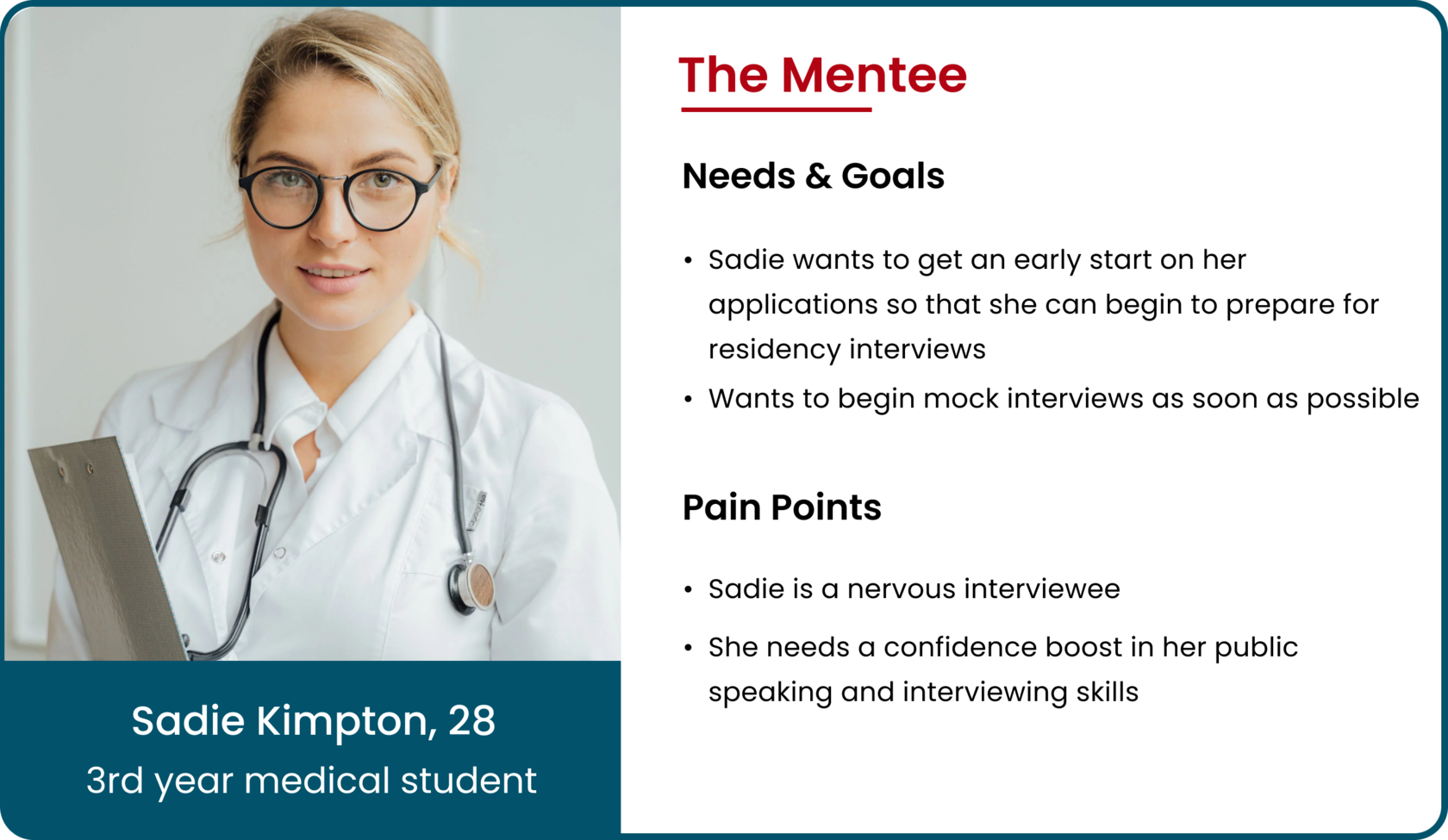
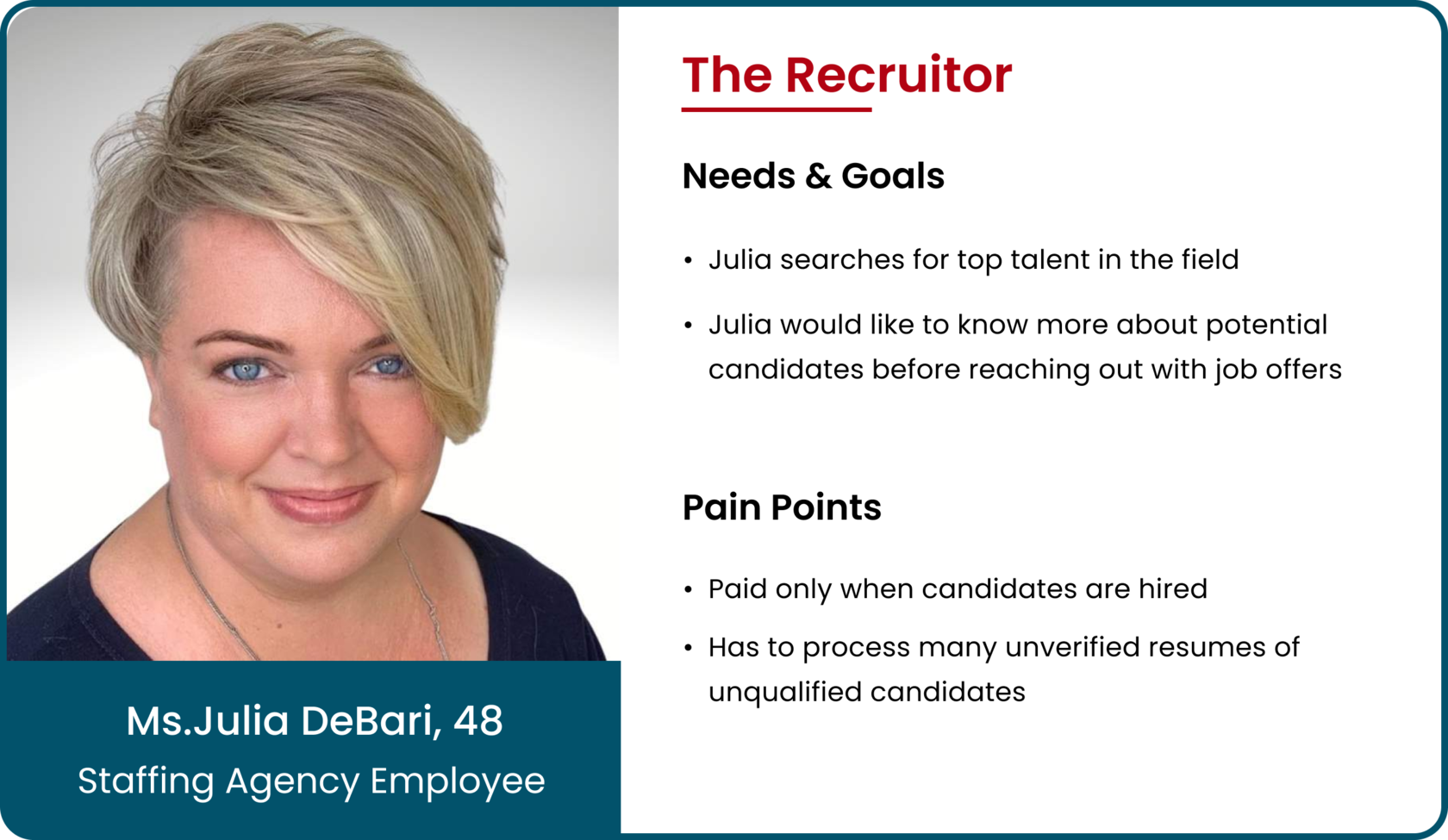
Persona 1
Persona 2
Persona 3
Task Flows
Since we have created personas, we identified what goals and needs users want to target. User flows were created to guide users step by step to achieve their goals.
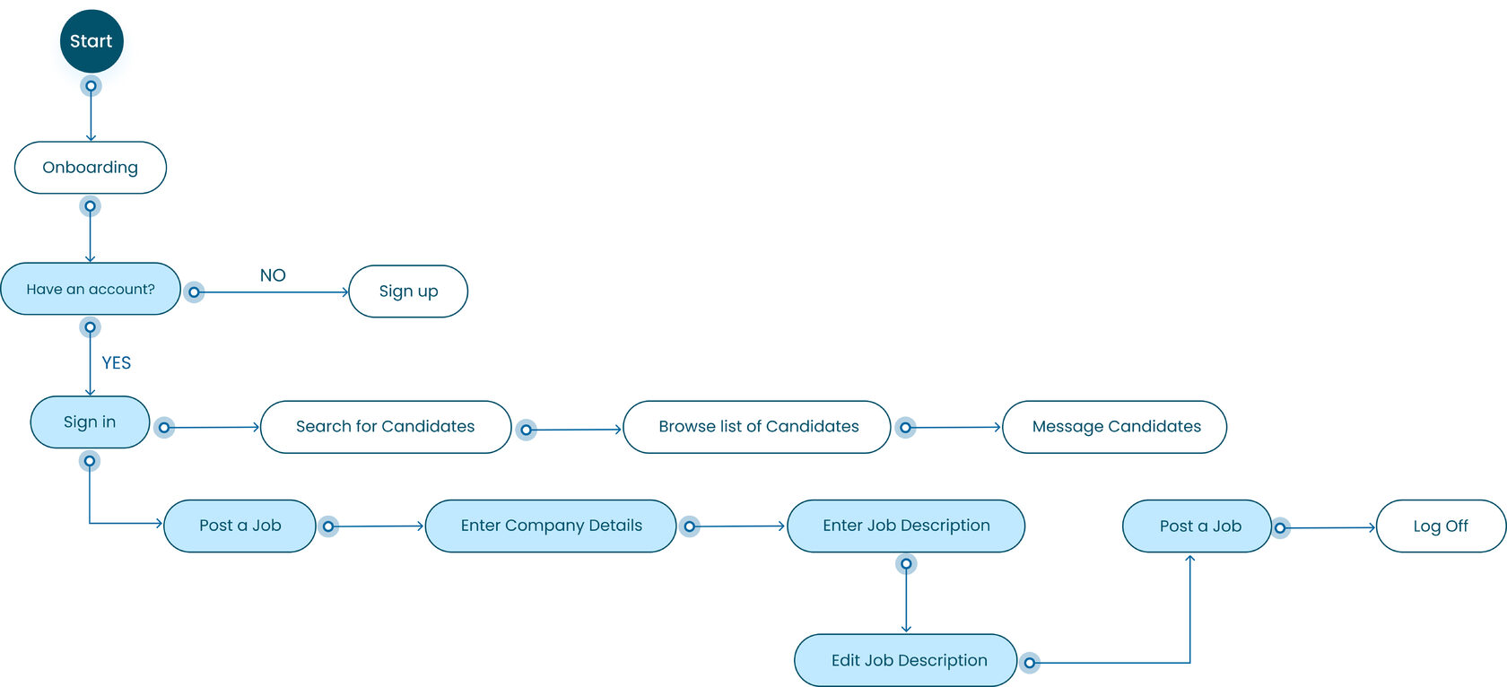
Recruiter's Flow
(Click to expand)
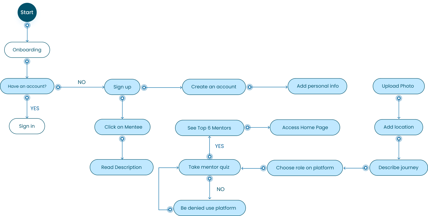
Mentee's Flow
(Click to expand)
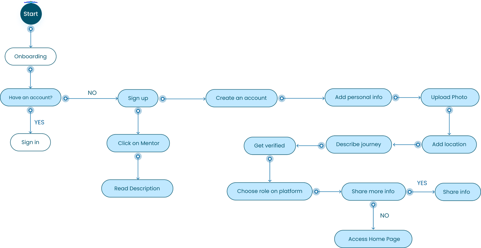
Mentor's Flow
(Click to expand)
3. Design pHase
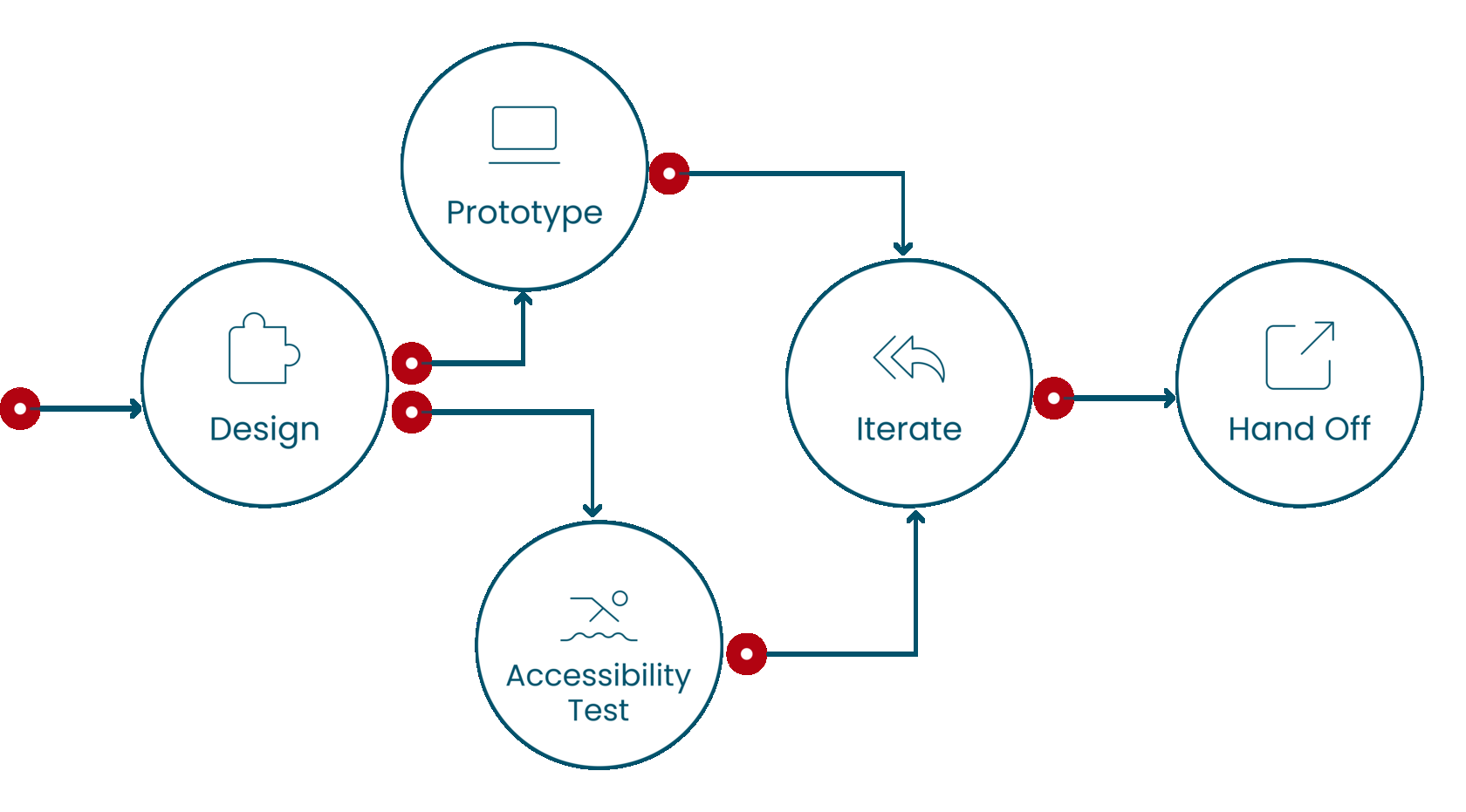
Based on the application’s wireframes (launch re-design app will be in January 2023) we received most of the content, a color scheme, and navigation. However, our task was not only to build parity of the application with the website, but also to add more helpful features and make the design accessible, clear for users, native, and more detailed than in the application.
From Strategy to Implementation
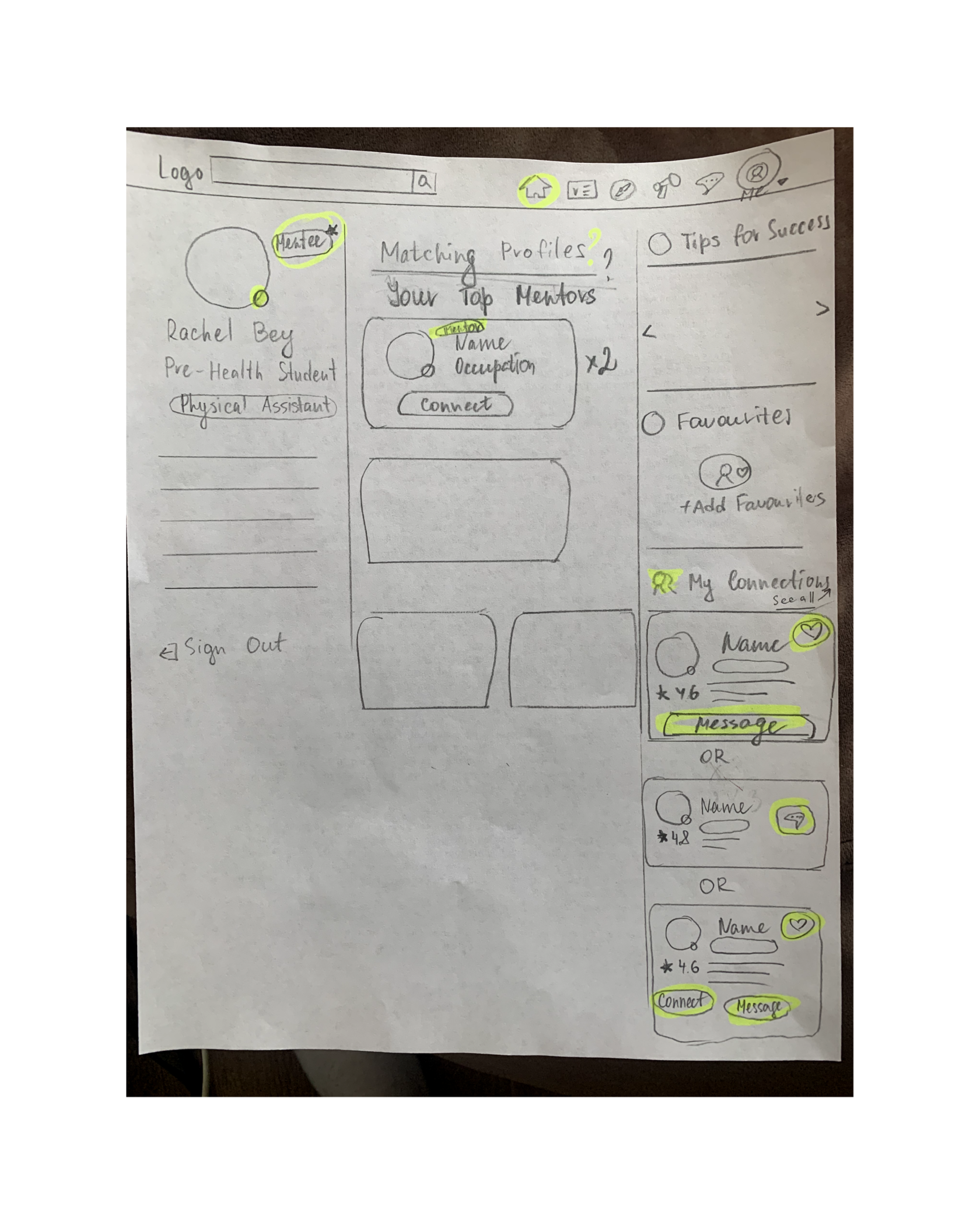
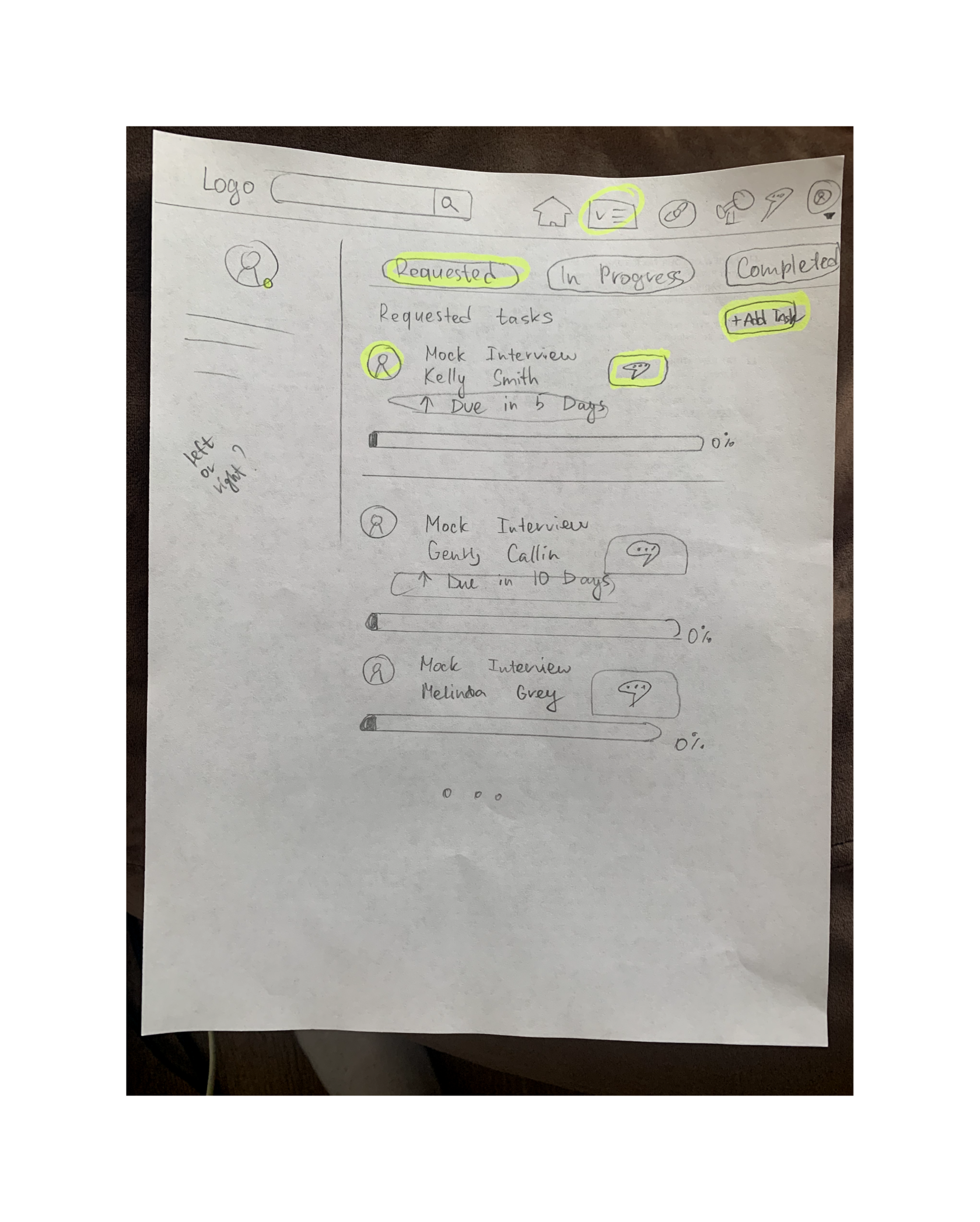
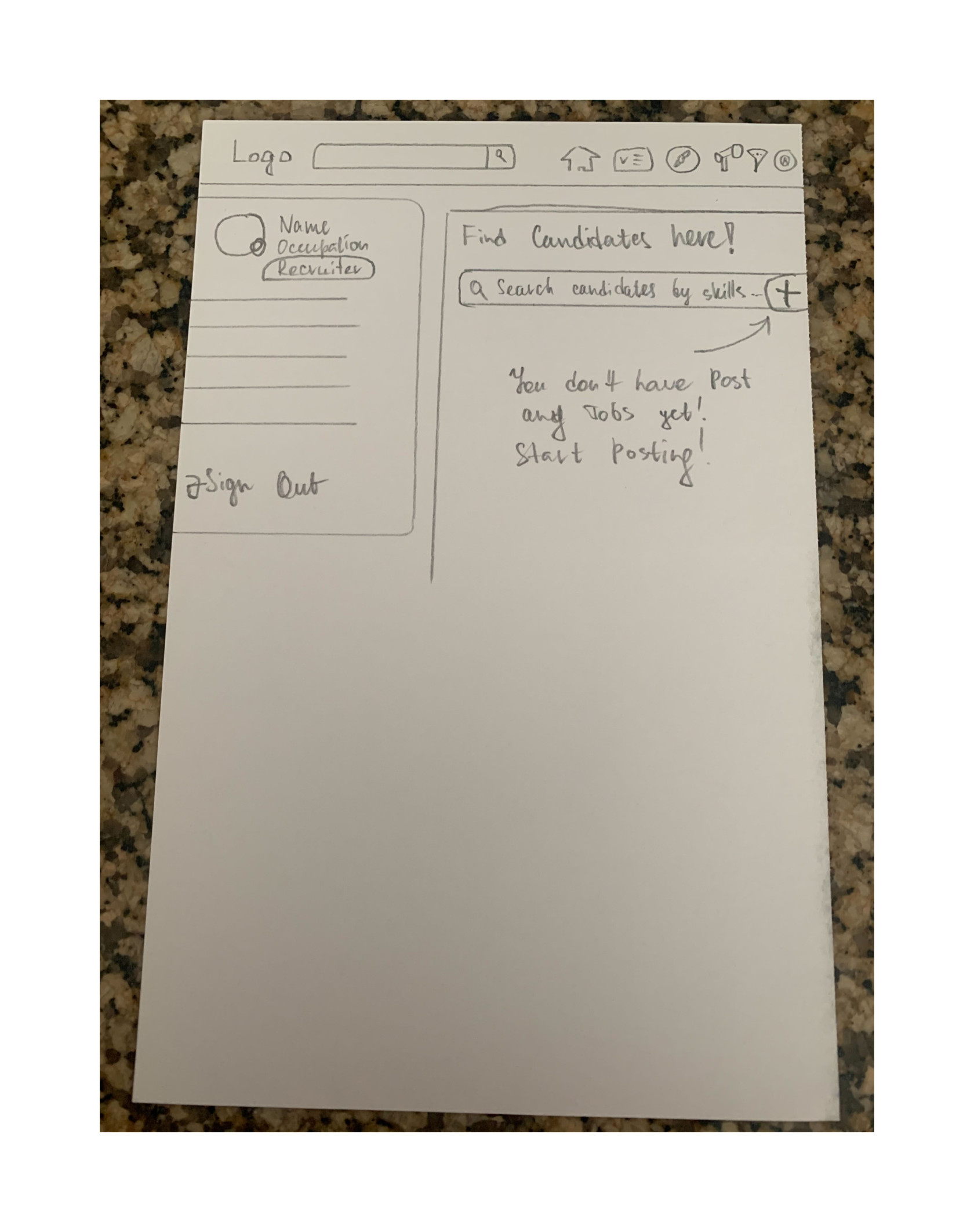
Mentee's Home Page
Tasks
Recruiter's Home Page
TeSTINg
Step 1.
Testing controversial issues in the app
In order to prevent difficulties for the user on the website we tested the application and also added some of our current solutions.
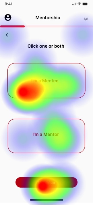
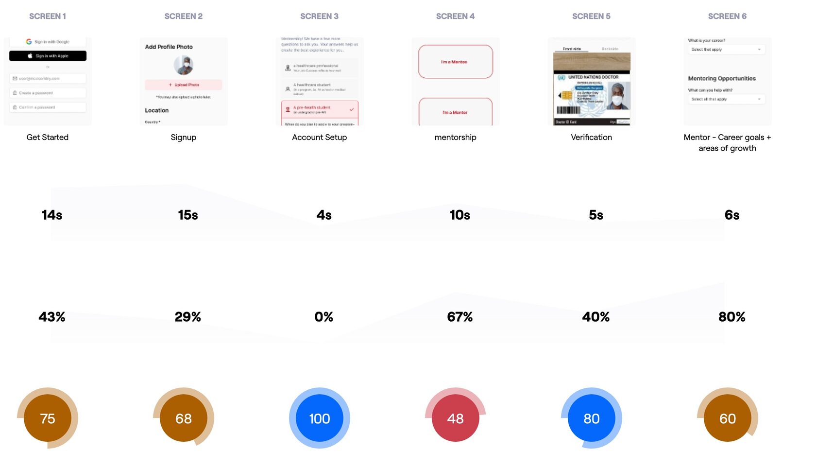
Onboarding for Mentor
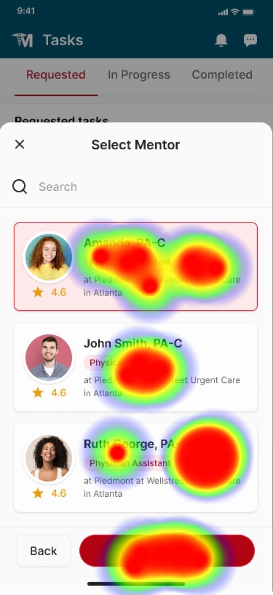
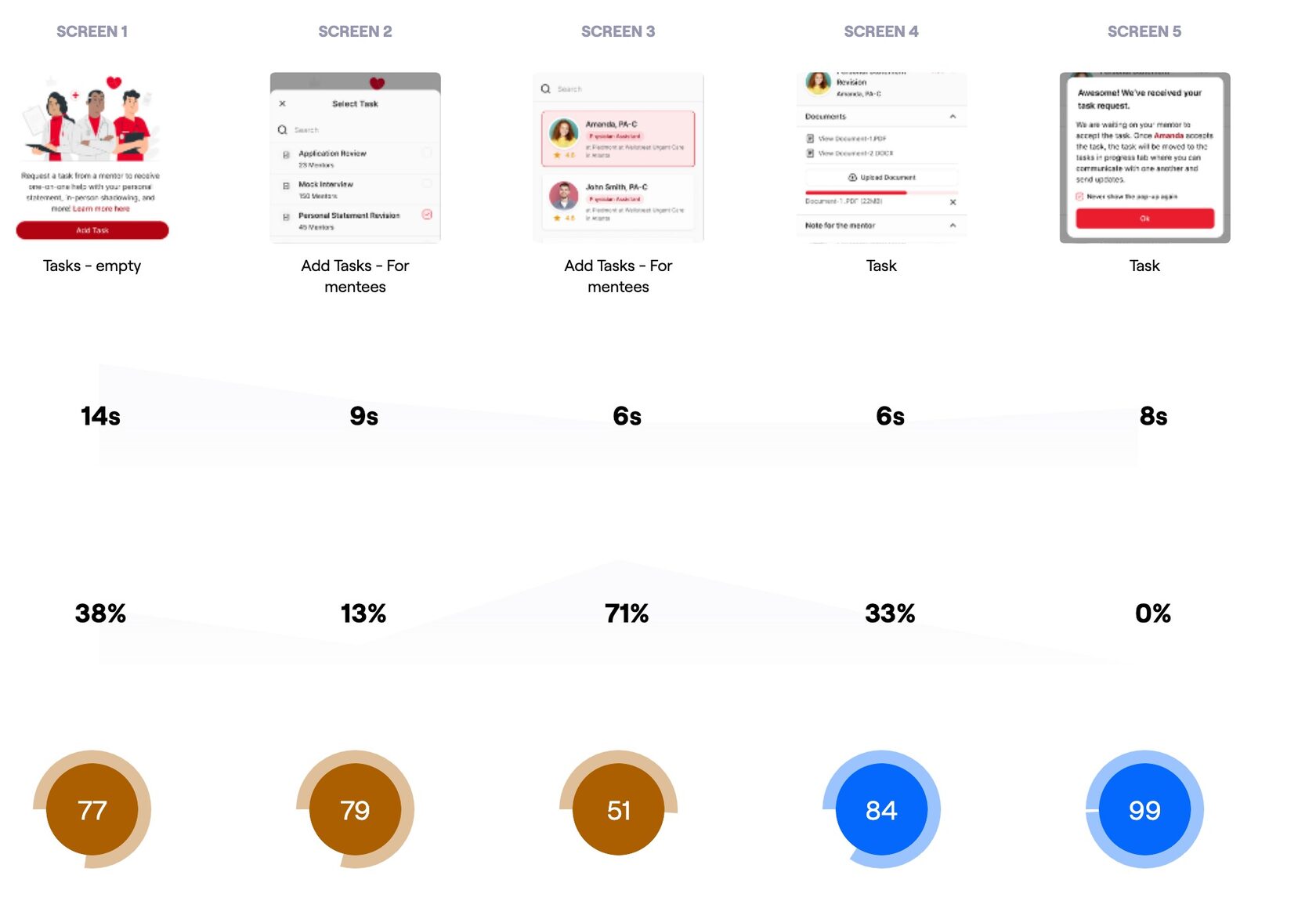
Select Task (Mentee Path)
What did we get?
- "the ability to go to the next step by simply clicking on the mentor, rather than click on continue button"
- the majority testers found the onboarding process very easy
- the majority testers found the onboarding process a little bit confusing
- is uploading a license photo necessary?
Mentee’s path:
Mentor’s path:
We fixed incomprehensible moments for users and then we moved on to testing the almost-final website.
Step 2.
Testing website
Our users gave us great feedback, providing us with direction for some much-needed changes and improvements, and also we got some great insights from a former healthcare recruiter.
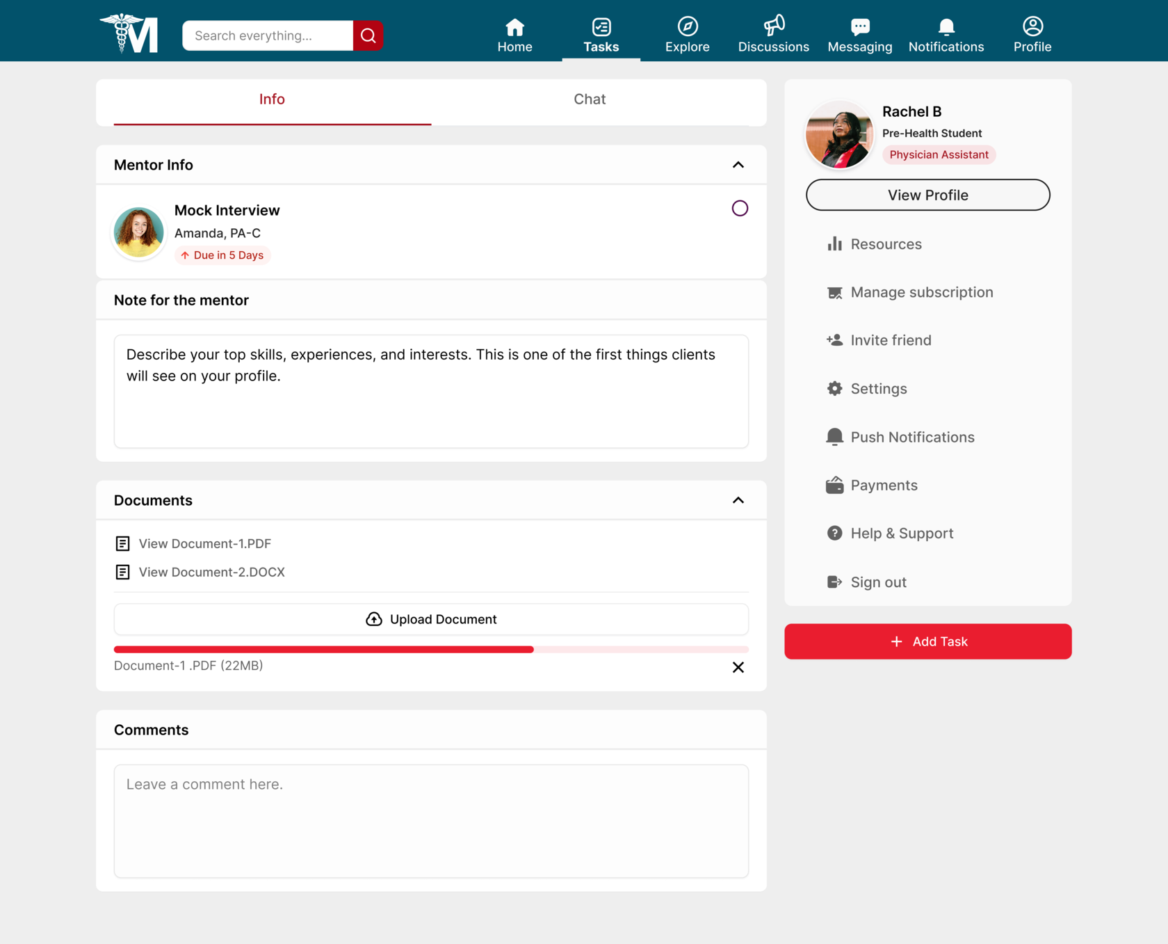
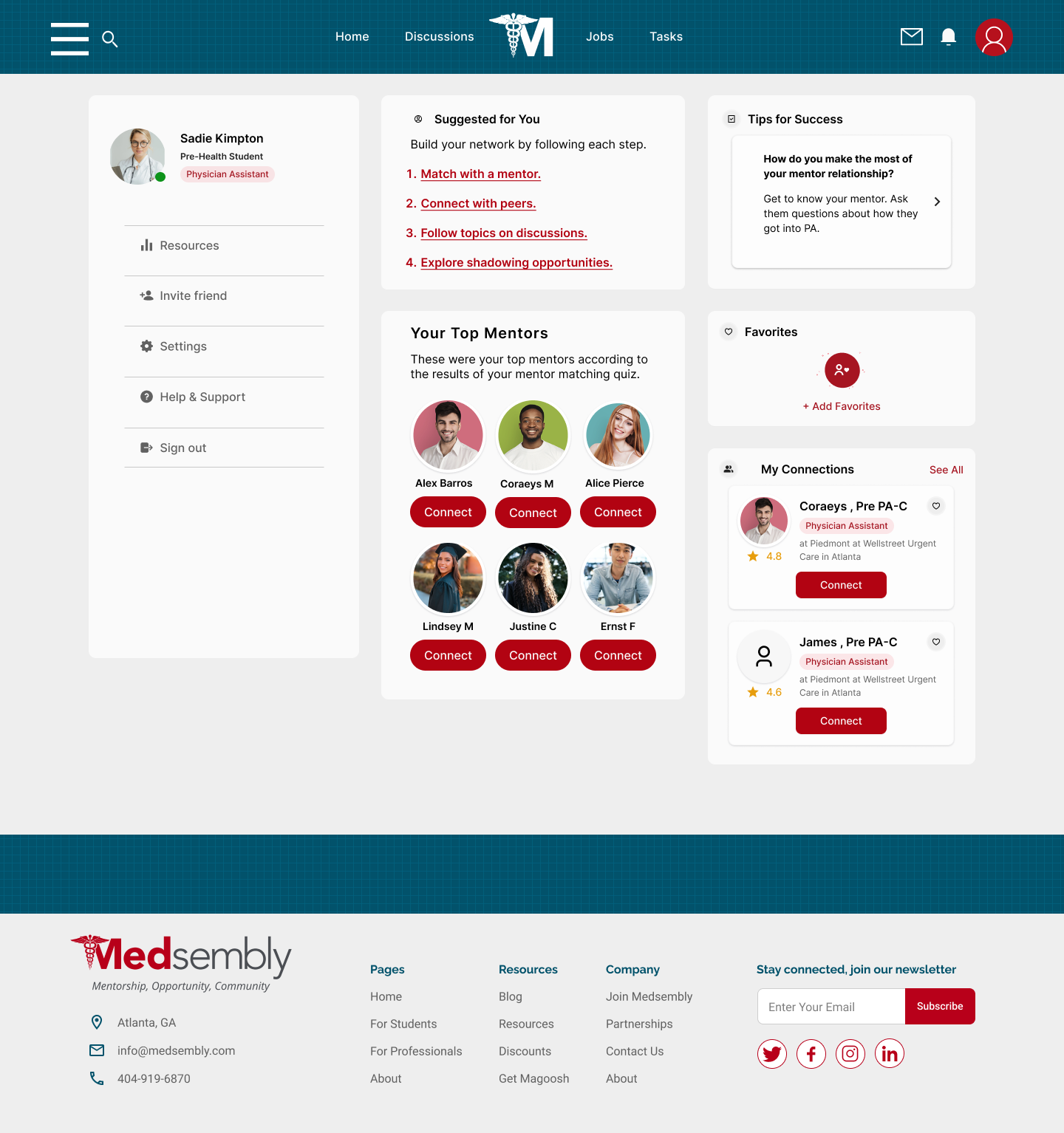
The first and possibly most significant change we made was to change the navigation process and made it clearer and more obvious for users.
1
Before
After
(Click to expand)
(Click to expand)

hamburger dropdown menu
With the new navigation on the website, the user will not be overwhelmed and instead of going to the "explore" page, the user will only need to click on the hamburger - menu.
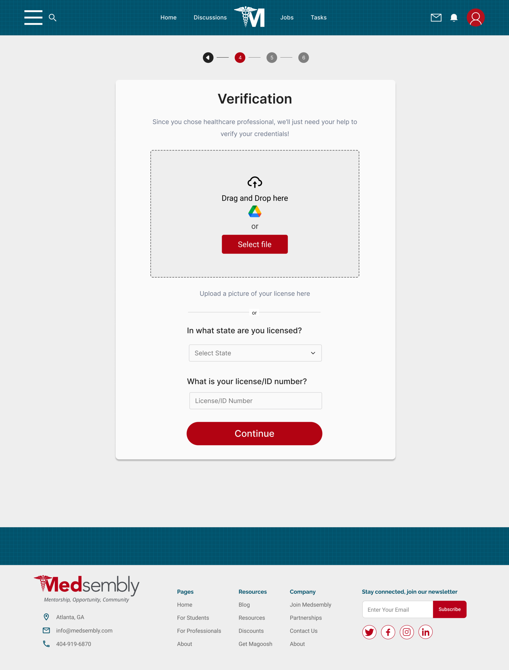
The second major change made was to add a verification process for the mentor and in addition to downloading the license, we have added the option to simply enter the license number.

2
Final Version
(Click to expand)
The verification process for a mentor was controversial from the start. We could not completely refuse verification, but the ability to only download a license did not suit users. Therefore, the possibility of verification on the site has become optional, so users can choose the option of entering information.
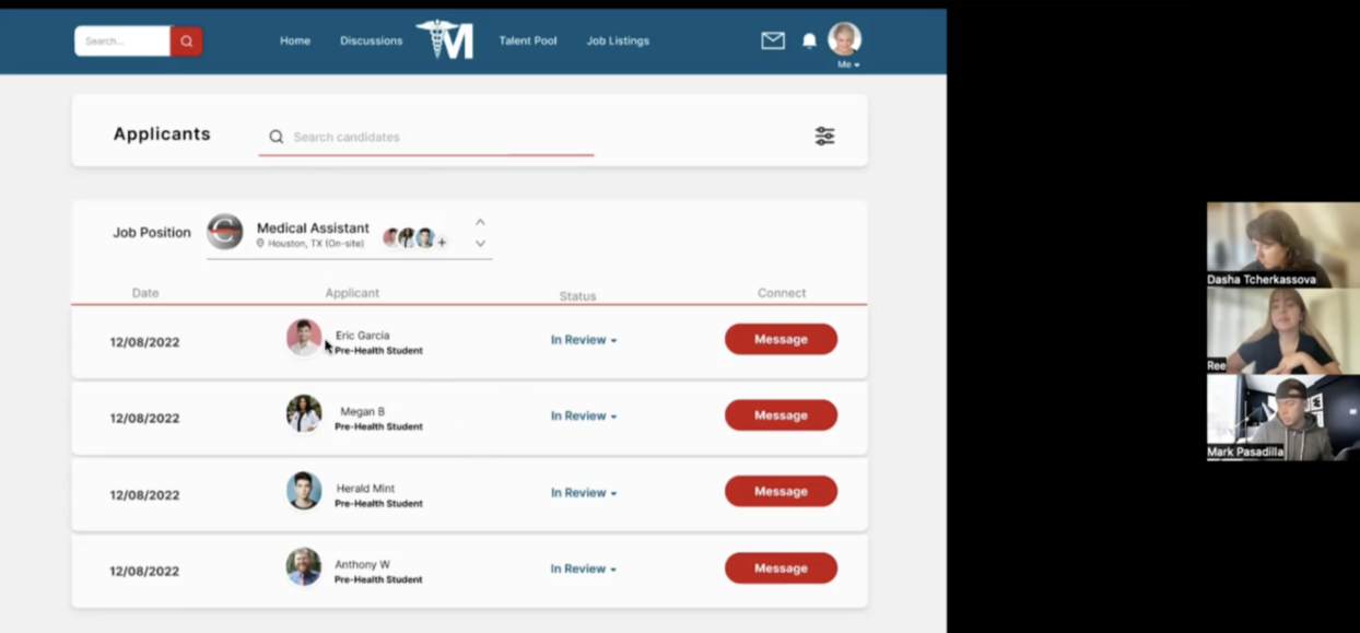
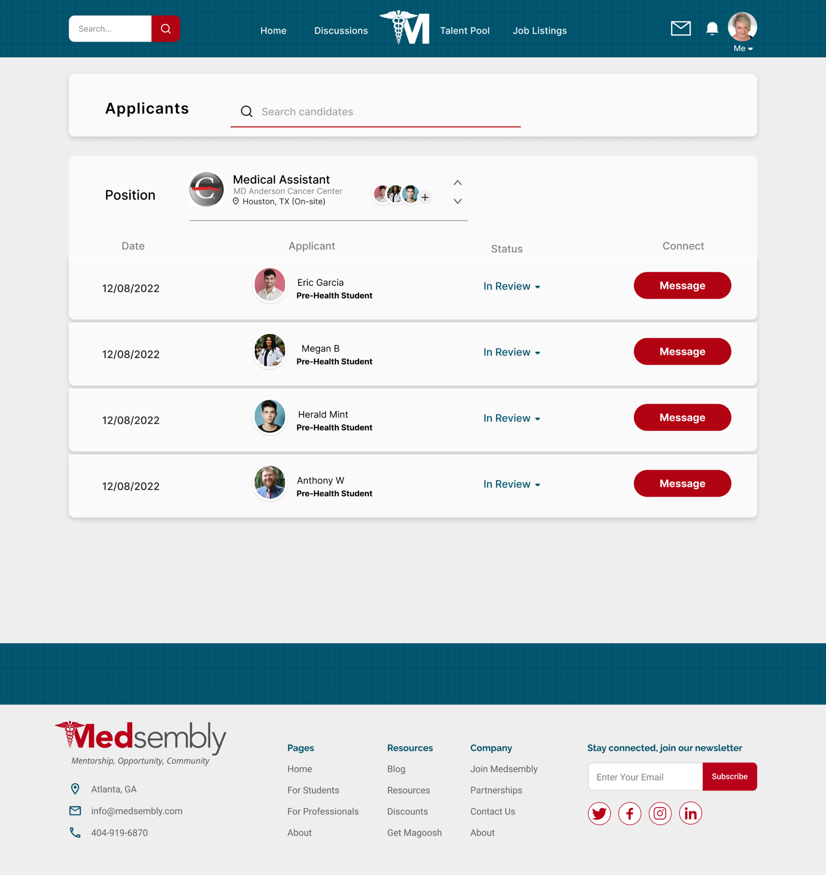
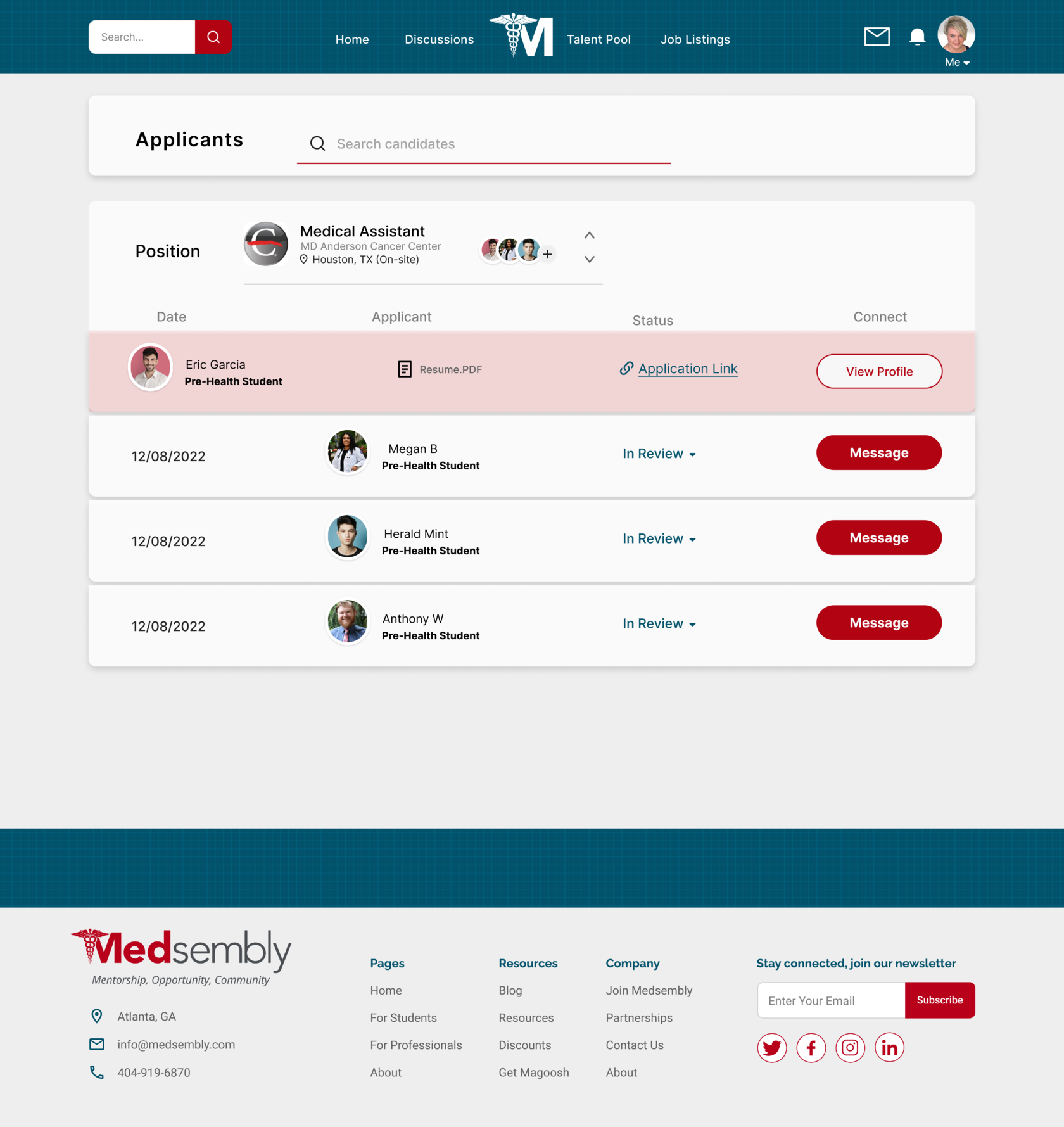
The third major change was to change the process of job posting and further search and interaction with potential employees.

3
Before
After
(Click to expand)
(Click to expand)

Active applicant card view
I created the recruiter path on my own and tested it many times. As testing progressed, the features changed every day and the steps for the user became more and more convenient and simple.
4. Welcome to MedseMbly
Let’s take a tour below to view the prototype!
Wrapping Up
Towards the end of our 3 week sprint, we held a final client meeting and presented our two latest high fidelity prototypes, which included preference testing results. The presentation in front of the founder of Medsembly as well as our mentor and the General Assembly team was a great experience and the end result was well received. It was important for the client that we first make the site parity with the application, while focusing on the experience of using the website by the mentor and recruiter, and our team was able to complete this in a short time. In the future, if we were to work with Medsembly again, we would like to work on path improvement for mentee, events page, news feed, and delve into settings and deeper navigation.
My Personal Growth
While no project is ever fully finished, I take great pride in our final prototype and the feedback it elicited from the users. As a team, we wanted to not only make the website parity with the app but also bring more useful features and we succeeded. In 3 weeks we made over 40+ unique screens, 22 of them are mine. The main roadblock I experienced was not being able to fit in all aspects of my ideas in the time I had. So I had to leave out many good ideas, and 100% focus on the details of the main paths that the client asked us to design. We made exciting prototypes that is both unique in concept and tangibly robust, one that I am very proud to share with you.
Let's work to improve the user experience together!

