LiNKedIN CReAtive
While LinkedIn remains a secure and promising resource for job-seekers, the way in which you’re allowed to present your work-self is still very much rooted in an older era of job searching. LinkedIn is essentially a dynamic, hyperlinked resume.
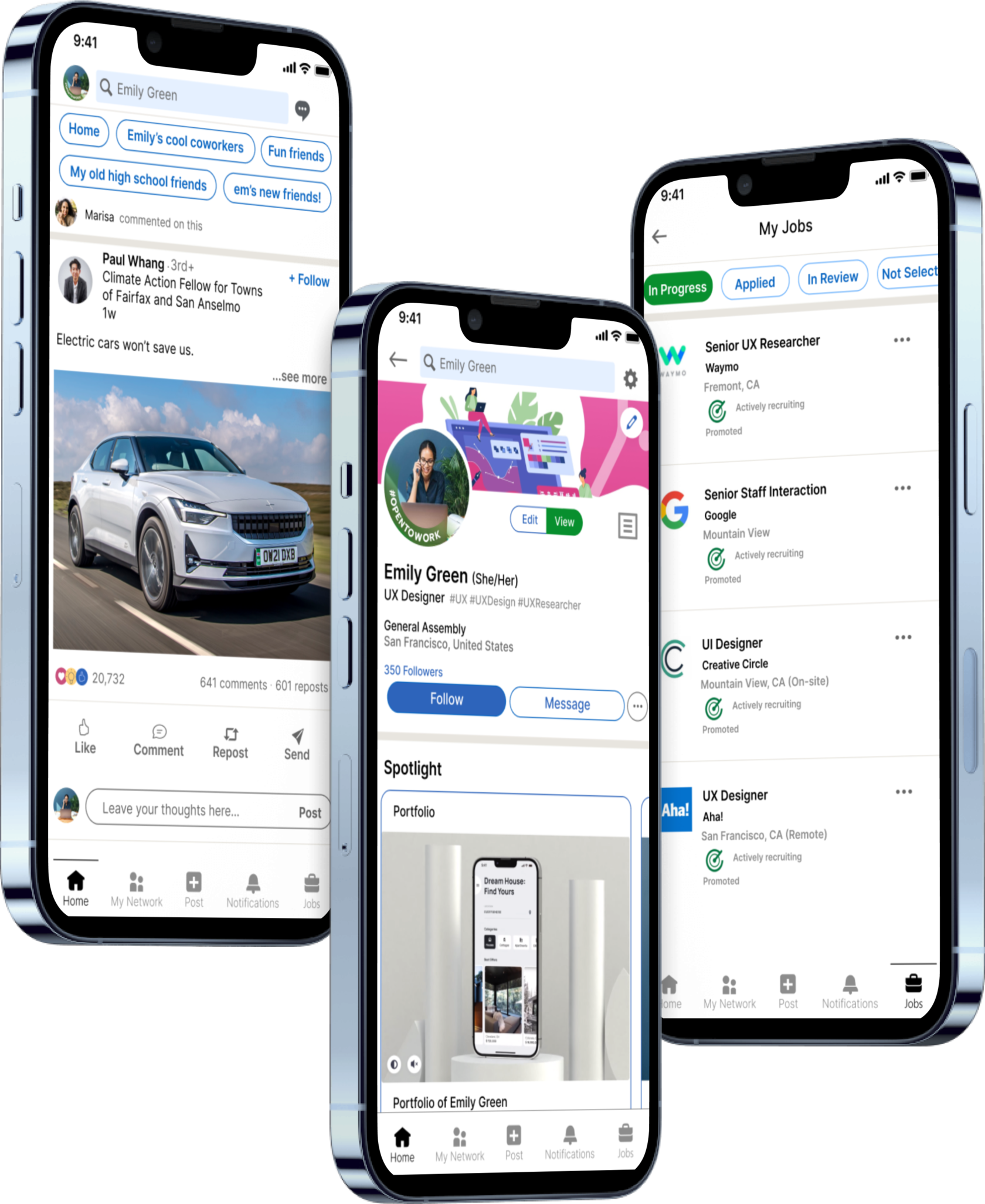
Redesign of LinkedIn app by creating more tools for makers to show off their work, convenient job search, and editable connection lists.
Redesign of LinkedIn app by creating more tools for makers to show off their work, convenient job search, and editable connection lists.
MoBILE APP Redesign

My Role
Lead UI Designer
Project Duration
2 weeks
Team
Ree Davydova, Sofia Torres, Karuna Yadav, Adrienne Yung
Figma, FigJam, Slack, Zoom, Google Suit, Toggl
Tools Used
User Research, Personas, Journey Mapping, MoSCoW Method, Task Analysis, Site Mapping, Wireframing, Usability Testing, Prototyping
Methods & Approach
Overview
LinkedIn has secured itself as the de-facto job search social network - using it is a graduation requirement, and it’s probably the only social network that Baby Boomers, Millennials, and Gen Z all use it regularly. LinkedIn has also achieved an often un-sung achievement - completely dodging the current social media crisis concerning privacy and toxic third-party propaganda.
While Linkedin continues to provide a plethora of opportunities to implement job searches and active blogging, users who work in creative industries are limited in terms of the work they can showcase on their profiles. In this project, a team of 3 UX designers and I redesigned the Linkedin mobile app to suit the needs of creative users better and relieve users of their current pain points.
While Linkedin continues to provide a plethora of opportunities to implement job searches and active blogging, users who work in creative industries are limited in terms of the work they can showcase on their profiles. In this project, a team of 3 UX designers and I redesigned the Linkedin mobile app to suit the needs of creative users better and relieve users of their current pain points.
LinkedIn does not provide many opportunities for creatives to display their work, and is essentially at its core a dynamic, hyperlinked resume. How can we create more tools for people in creative, technical, and craft-based industriesto properly showcase their work, without having to completely rely on external sites?
MAIN Problem
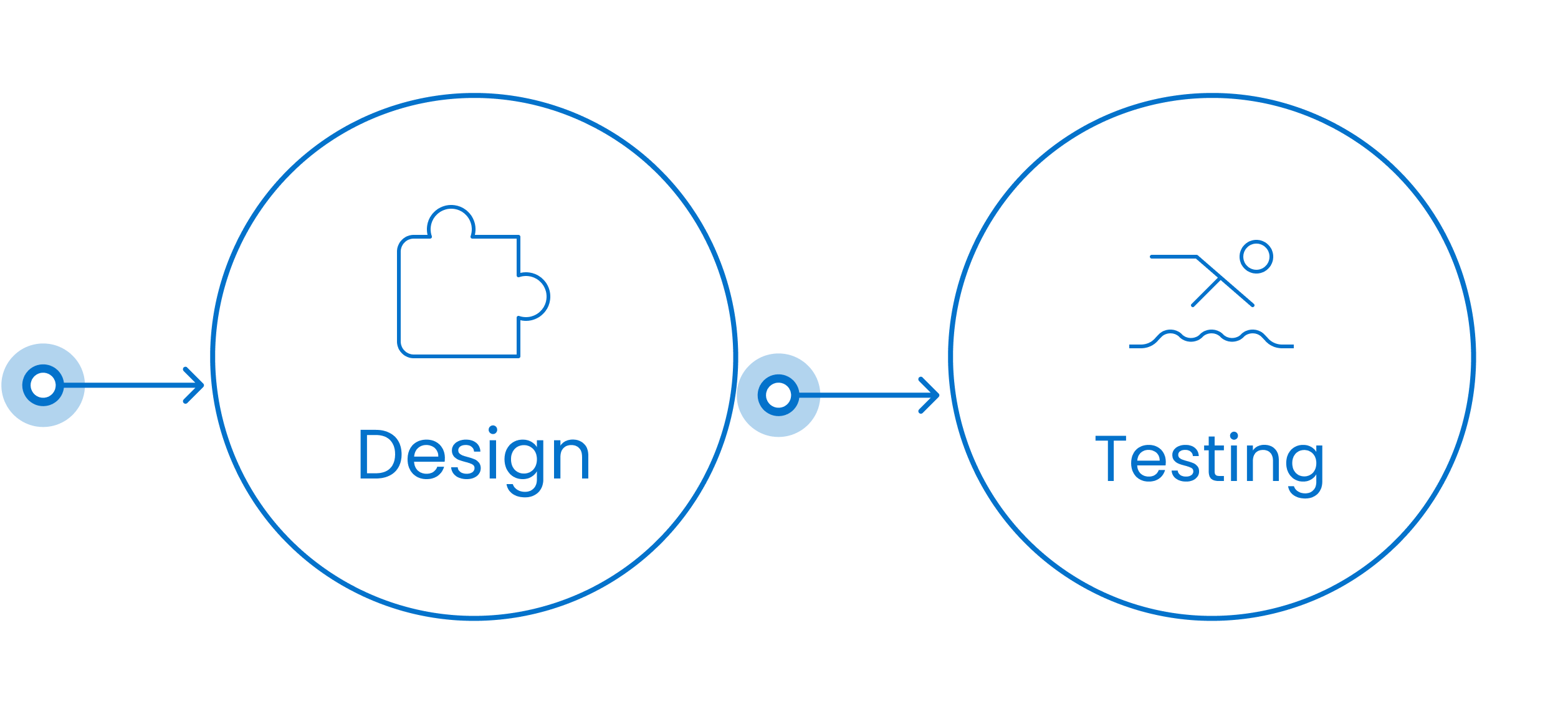
Design Process
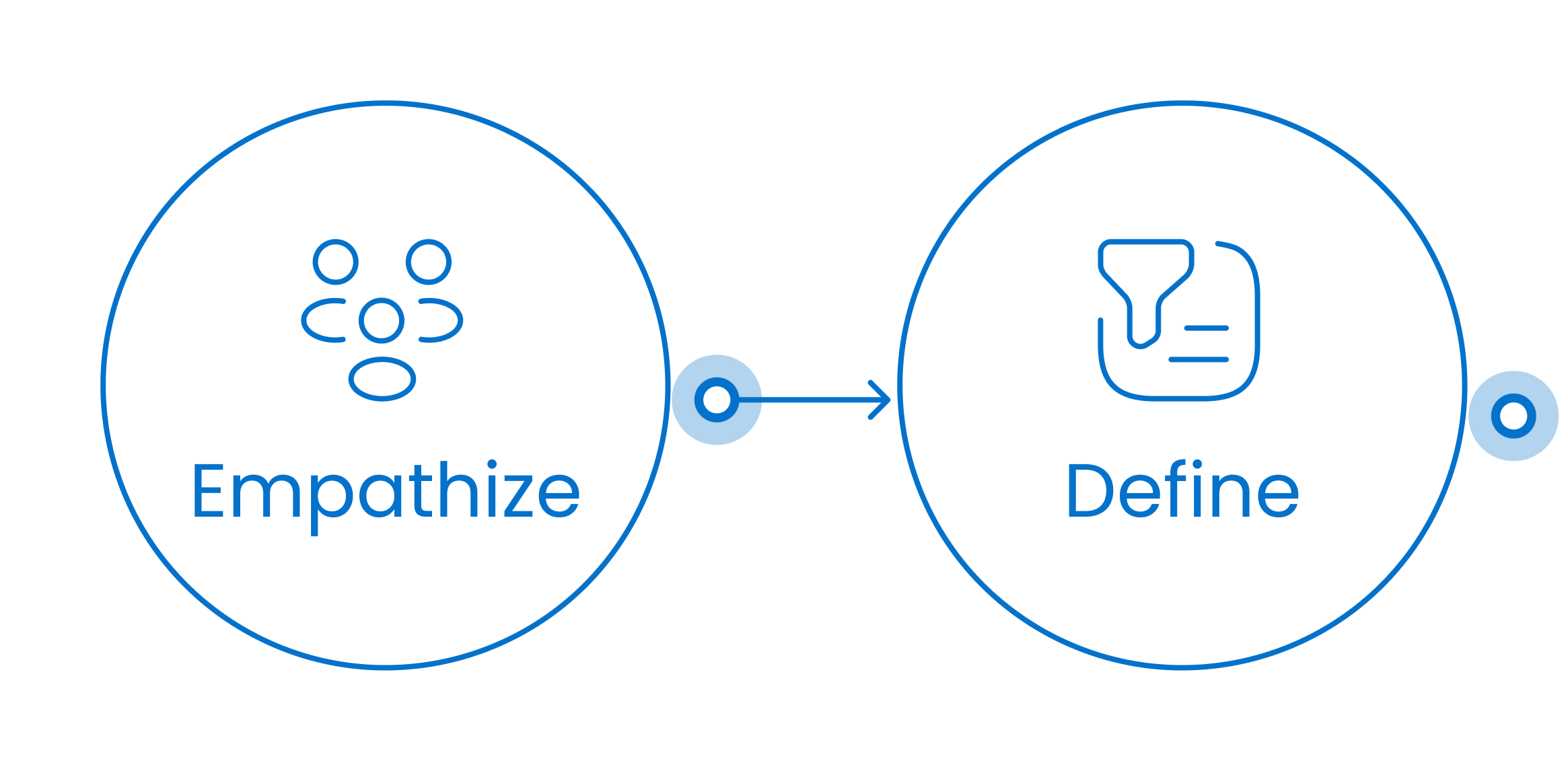
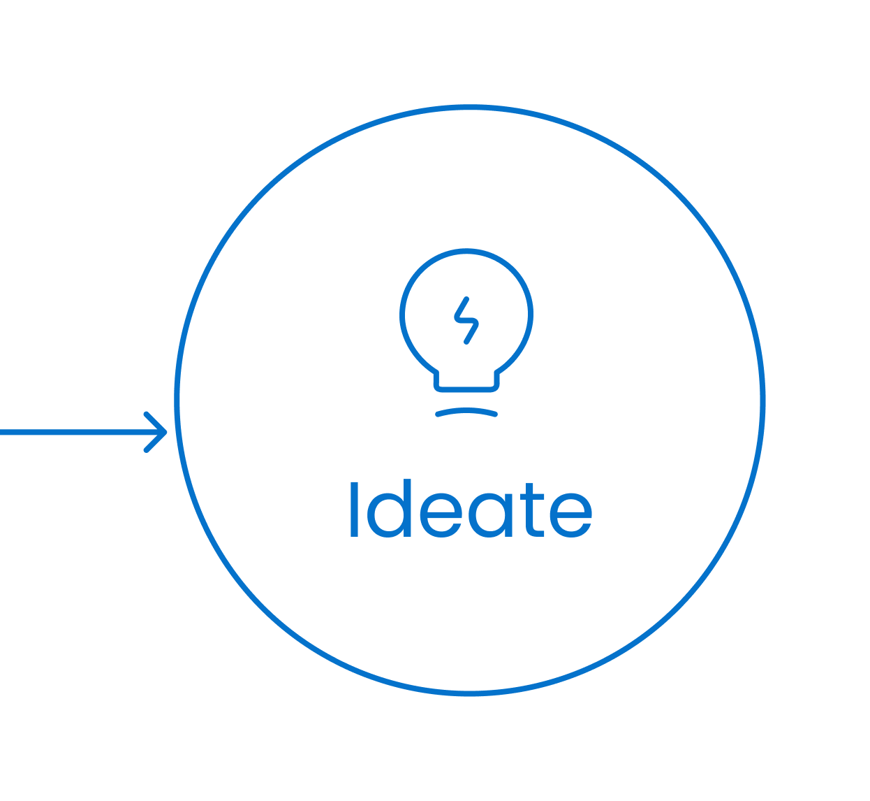

1 week
- User Interviews
- Surveys
- Affinity Map
- Comp. Analysis
2 week
- Personas
- Problem & Solution Statement
- MSCW Method
- Task Analysis
- Journey Maps
- Task Flows
- Site Map
- Sketches
- Prototype
- Wireframes
- Usability Testing

Empathize
To start our research, my team and I wanted to discover what creative users want to show on their LinkedIn profile, and any other issues they had with showcasing or anything else. But for a complete understanding of the picture we decided to also interview recruiters and hiring managers because the main goal of LinkedIn itself is job searching and this is at least a two-way process.
In total, we conducted 8 interviews, which included creative professionals (UX designers, graphic designers, and software developers) and recruiters. We also received a questionnaire in order to obtain not only qualitative but also quantitative data.
In total, we conducted 8 interviews, which included creative professionals (UX designers, graphic designers, and software developers) and recruiters. We also received a questionnaire in order to obtain not only qualitative but also quantitative data.
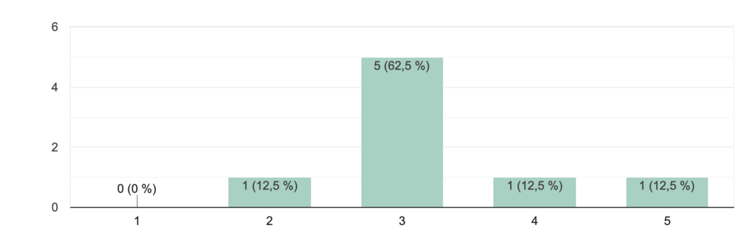
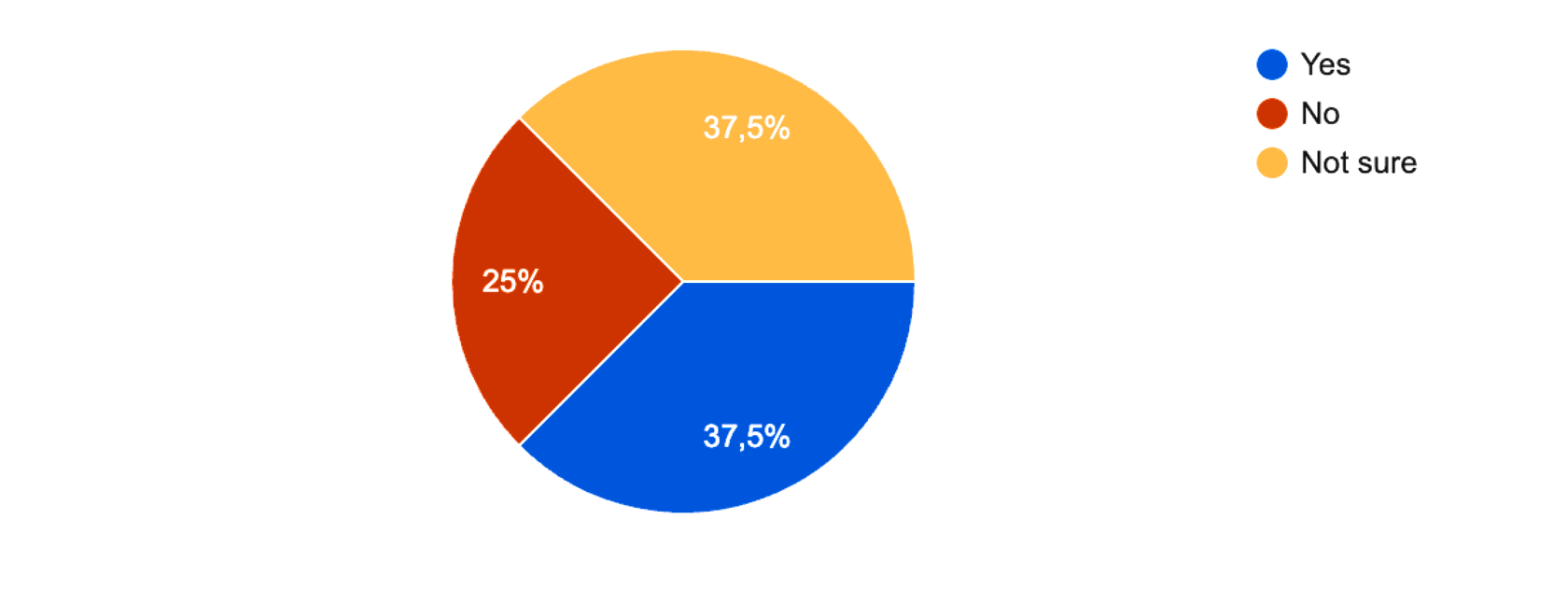
Do you find LinkedIn an effective platform to potray your work?
Does LinkedIn have enough tools for you to demonstrate all your working skills and achievements?
1 (12.5%)
5(62.5%)
1 (12.5%)
1 (12.5%)
Only 37.5% of users reported that Linkedin was an effective platform to portray their work.
But most of users - 62.5% felt that LinkedIn provided enough tools for them to showcase their creative work.
But most of users - 62.5% felt that LinkedIn provided enough tools for them to showcase their creative work.
Using an affinity map to synthesize the data, we got some invaluable information. Most users found that there is no way to track the job applications you applied for and there are no standards around how you can showcase your work. Also some have noticed that they ned vailability of allshared data by individuals.
“I think LinkedIn is not geared for design professionals.
“I think there are not much customization to make profile stand out.”
“I wish I can have a customized contact list. Because not all connections are similar.”
“I feel like I understand more about a person from looking at a portfolio itself than just a LinkedIn page.”
“I think there are not much customization to make profile stand out.”
“I wish I can have a customized contact list. Because not all connections are similar.”
“I feel like I understand more about a person from looking at a portfolio itself than just a LinkedIn page.”
Points users noted
(Click to expand)
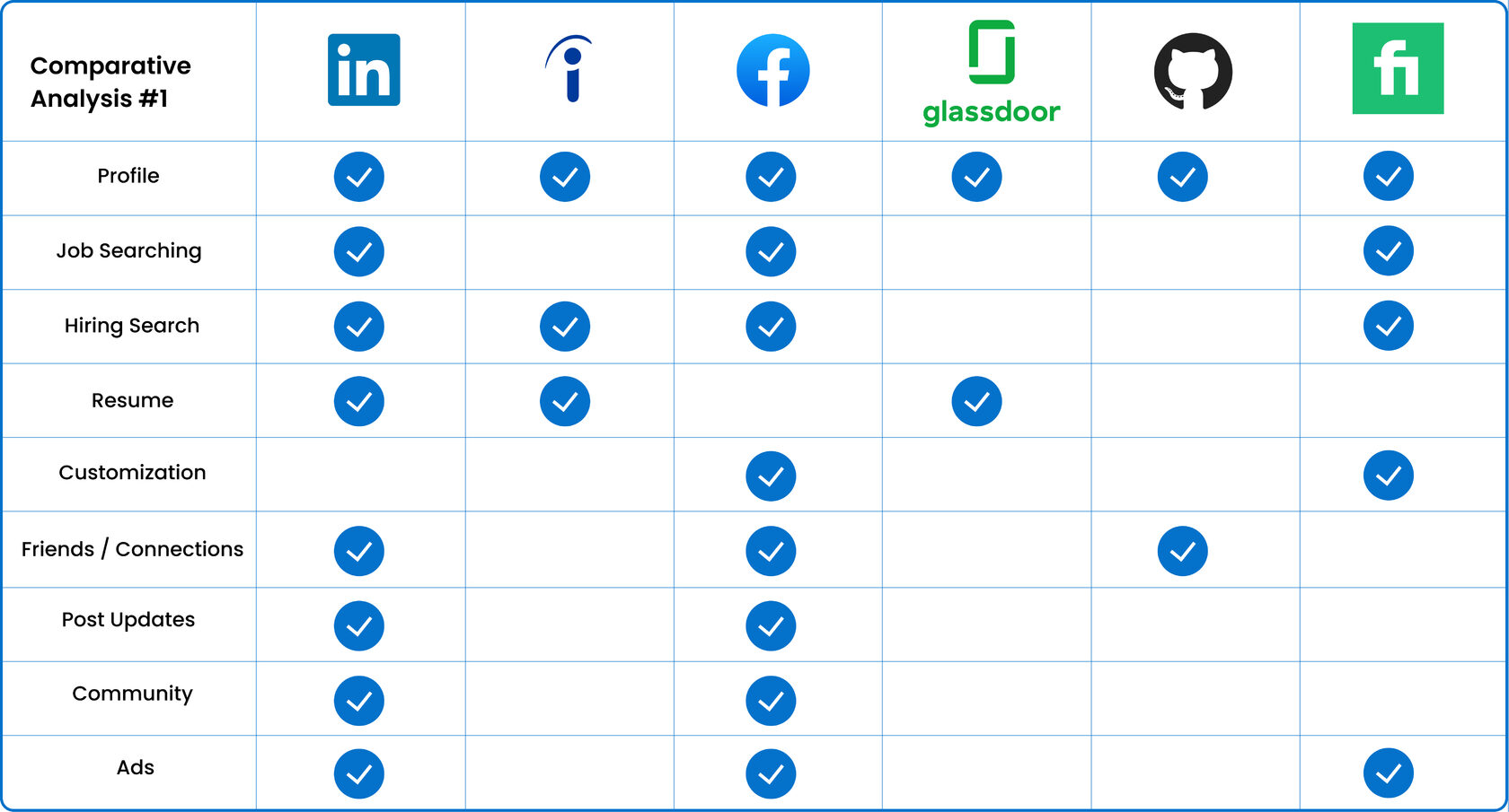
Comparative Analysis #1
(Click to expand)
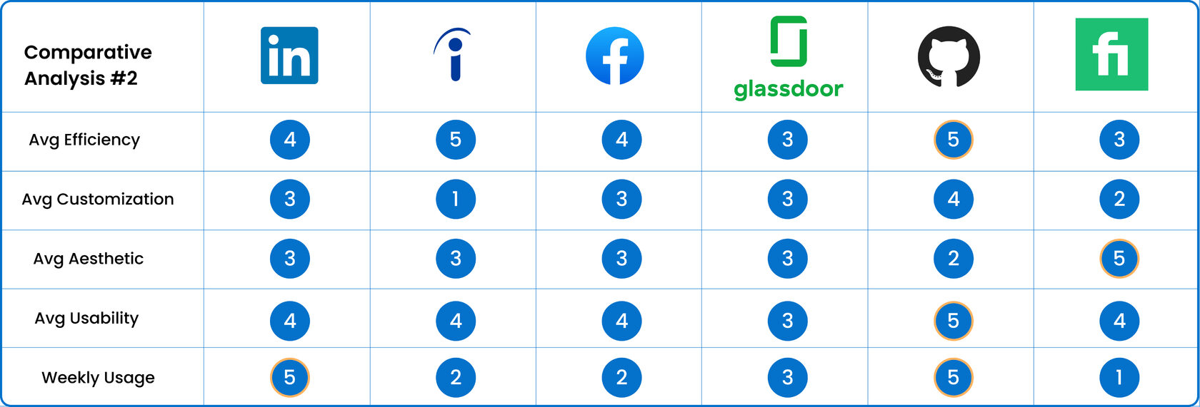
Comparative Analysis #2 (scale 1 to 5)
We ran a competitive business analysis to compare LinkedIn to the apps and websites of competitors like Indeed, Facebook, Glassdor, Github and Fiverr. In the analysis, we compared the aspects important for our research and subjectively assessed external characteristics and involvement from 1 to 5. Our main goal was to got some insights and find any features that could be used as inspiration for our project.
Define
Using these key findings from user interviews and survey, we created two personas to reflect the needs and goals of creatives and recruiters, which represented our target audience.
Job seeker

About the user
Emily is confident designer who likes to stay on top of her customers' needs. During her free time, she likes to do puzzles and watch tech news.
Scenarios (Job Seeker)
- LinkedIn premium user.
- Mostly busy due to work and active lifestyle.
- Requires a platform easy to use and comprehensible to keep up with her networking and search updates.
Goals & Needs
- Would like to organize schedule her job search in an efficient manner.
- Able to showcase her portfolio and creations on single platforms.
- Optimize job search by minimizing the distractions of social content.
- Want a streamlined job search and tracking process that is intuitive, efficient and easy to use.
Demographic Information
Name: Emily
Age: 28 y.o.
Occupation: UX Designer
Income Range: $90.000 - $120.999
Age: 28 y.o.
Occupation: UX Designer
Income Range: $90.000 - $120.999
Behaviors
- Social
- Flexible
- Currently looking for opportunities
- Actively applies and networks on LinkedIn
- Looking to make a mid-career transition
Challenges
- Limited tool available to portray her work.
- Uploading documents is time consuming.
- Unnecessary feed on home page causing distraction.
- Unable to track status of job application
Recruiter

User Description
Rayne is a mother and corgi owner, she is personable and leads an active lifestyle. She is proactive, empathetic and ambitious.
Scenarios (Job Hiring)
- Uses LinkedIn premium subscription.
- Finding the right fit for the organization.
- Need to create a list of candidates that have done relevant work in past for the open position.
Goals
- To close open positions as soon as possible.
- All the experience and project info should be available on a single platform.
- Would like to avoid clicking on several links on candidate's projects.
Demographic Information
Name: Rayne
Age: 38 y.o.
Occupation: Recruiter
Income Range: $120.000 - $140.000
Age: 38 y.o.
Occupation: Recruiter
Income Range: $120.000 - $140.000
Company roles
- Post jobs.
- Screen candidates and move them through hiring process.
- Uses mobile mostly when commuting to work.
Frustrations
- High volume of candidates needs to screen.
- Rejecting candidates after doing advance filters and going through all the links available.
- Screening candidates on mobile application is tedious.
Ideate
After creating personas and understanding their goals and needs, we moved on to the process of deciding what features would make our target users’ time in the LinkedIn app more useful and easy using the MoSCoW Method to further refine our proposed list and determine what we must, should, could and won't implement in our redesign to create our MVP.
Must Have
Could Have
Should Have
Won't Have
- Job description
- Search functionality
- View applied jobs
- Basic profile settings and connections
- Saved jobs
- Ability to upload any type of documents (PDF, JPEG, etc.)
- Nav bar with 4-5 icons
- Messaging
- Post feature
- Notifications feature
- Highlight in the search for active applicants
- Filter for connections
- On profile page-relevant skills displayed at top (tags).
- All upcoming and completed interviews (calendar).
- The ability to create lists of employees that you have selected (for a recruiter) and lists of companies where you would like to find a job (for a job seeker)
- Filter and interesting news for you
- Suggested people to connect to
- Kanban board for job application tracking
- Spotlight (“pinning”) feature on each document that is uploaded to showcase relevant work for employers
- CTA for all the work related links.
- QR code
- The ability to open links in the same window (if it's possible) shadow pop-up window
- Background photo customization for profile page
- Complete privacy feature
- Unnecessary social feeds
- QR Code
- Spotlight Feature
- Profile Layout Customization
- Home Feed Filters
- My Jobs Kanban board
- My Projects
As a result of our team brainstorming, we decided to add these features:
- Toggle Profile Edit/View
- Editable Connections Lists
And more profile customization options will be added so that users like Emily and Rayne will have a more efficient time obtaining their career goals.
Journey map
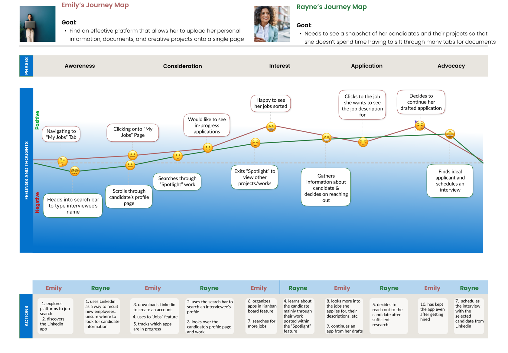
Final Journey Map
(click to expand)
After my team and I decided what features we would add to our project, we created Journey maps for both of our personas to visualize the the LinkedIn experience they go through to reach their goal.
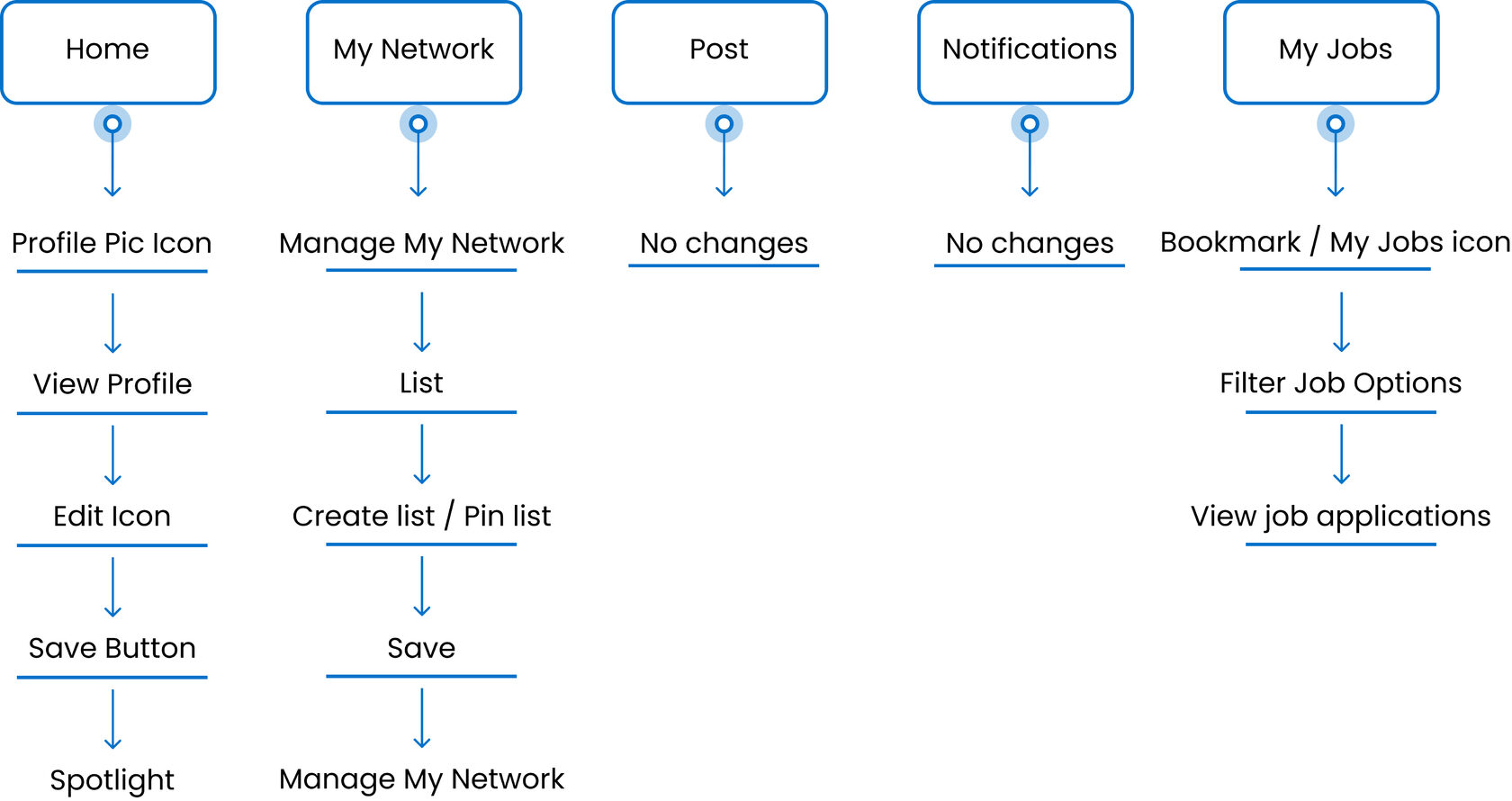
The next step was to create User's Task Flows and compile a Sitemap to clearly understand the movement of our users through the application and also to get a whole picture for the design process.

(Click to expand)
Emily's Task Flow

(Click to expand)
Rayne's Task Flow
(Click to expand)
Sitemap
In the process of creating wireframes, we first created low fidelity wireframes and then after getting the approval of the testers, we delivered 25 high-fidelity wireframes. And here are the main 7 features that solve user problems and which, as a result, changed the user experience of LinkedIn:
Showcasing
2
3
1
4
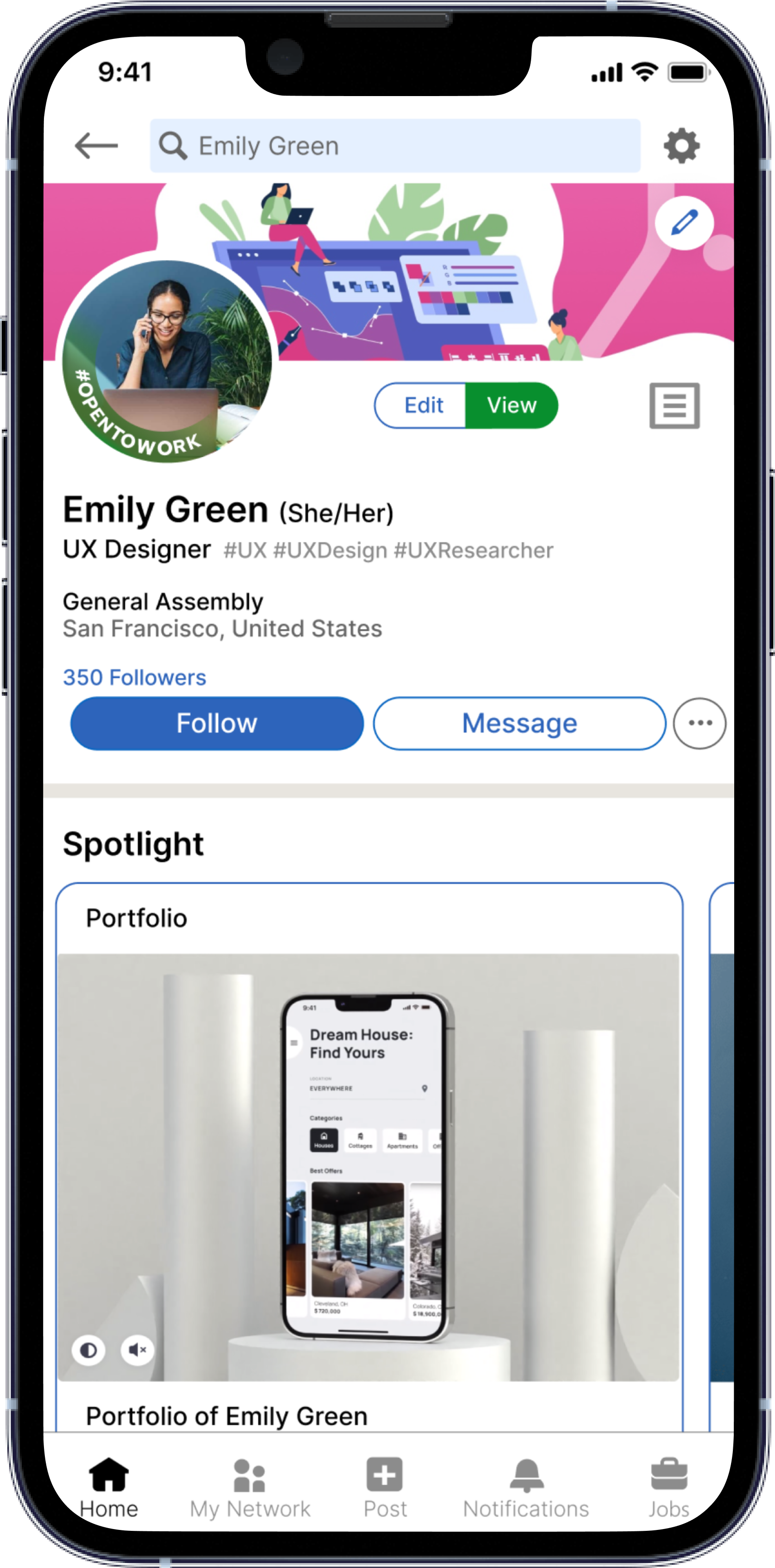
2) Drag - and - drop
In View mode editing now allows moveable layout prioritized on what user wants to show.
In View mode editing now allows moveable layout prioritized on what user wants to show.
1) View / Edit Mode
Now users can switch from Edit mode to View mode.
In Edit mode, users can make all changes and add new information.
View mode - this is how your profile looks to others and users can also move sections with drag - and - drop.
Now users can switch from Edit mode to View mode.
In Edit mode, users can make all changes and add new information.
View mode - this is how your profile looks to others and users can also move sections with drag - and - drop.
3) Spotlight Section
Users can add anything to the Spotlight that they consider shows their best sides and achievements, and spotlight is the first one, and stands out from the rest of the information as well.
Users can add anything to the Spotlight that they consider shows their best sides and achievements, and spotlight is the first one, and stands out from the rest of the information as well.
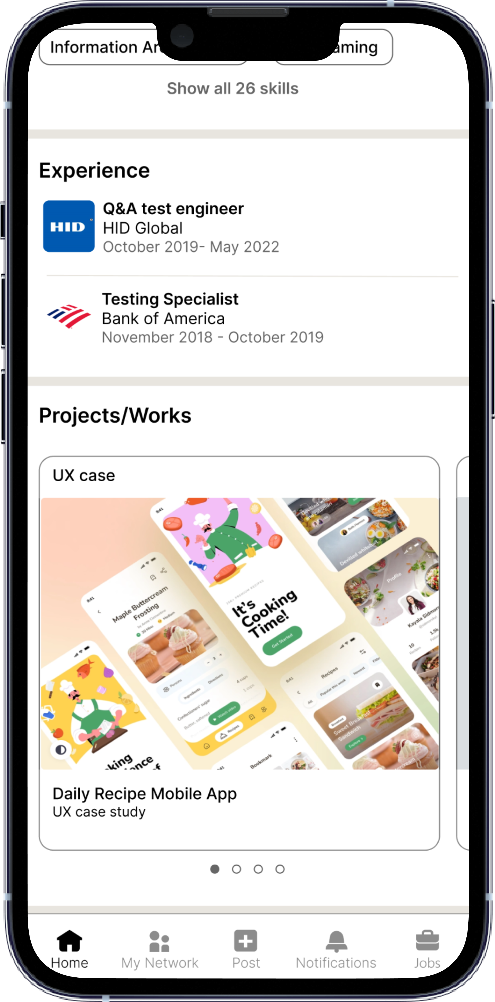
4) Projects / Works Section
Special section for showcasing users work and projects.
Here users upload any projects with a description and prioritize them in any order.
Special section for showcasing users work and projects.
Here users upload any projects with a description and prioritize them in any order.
Quick Connection

After
Before


5
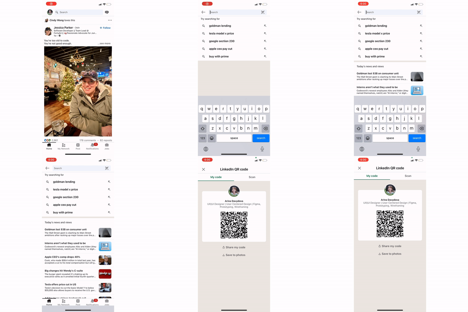
5) QR Code
QR code feature for an easier ability to share a profile when users interacting in-person with someone.
QR code feature for an easier ability to share a profile when users interacting in-person with someone.
In current LinkedIn app users can share profile through the QR code and it’s very convenient, but most individuals mentioned that this feature is located in the form of a very small icon in the search bar and if no one told them about it, they might never know.
So we decided to add this feature in quick access.
So we decided to add this feature in quick access.
My network
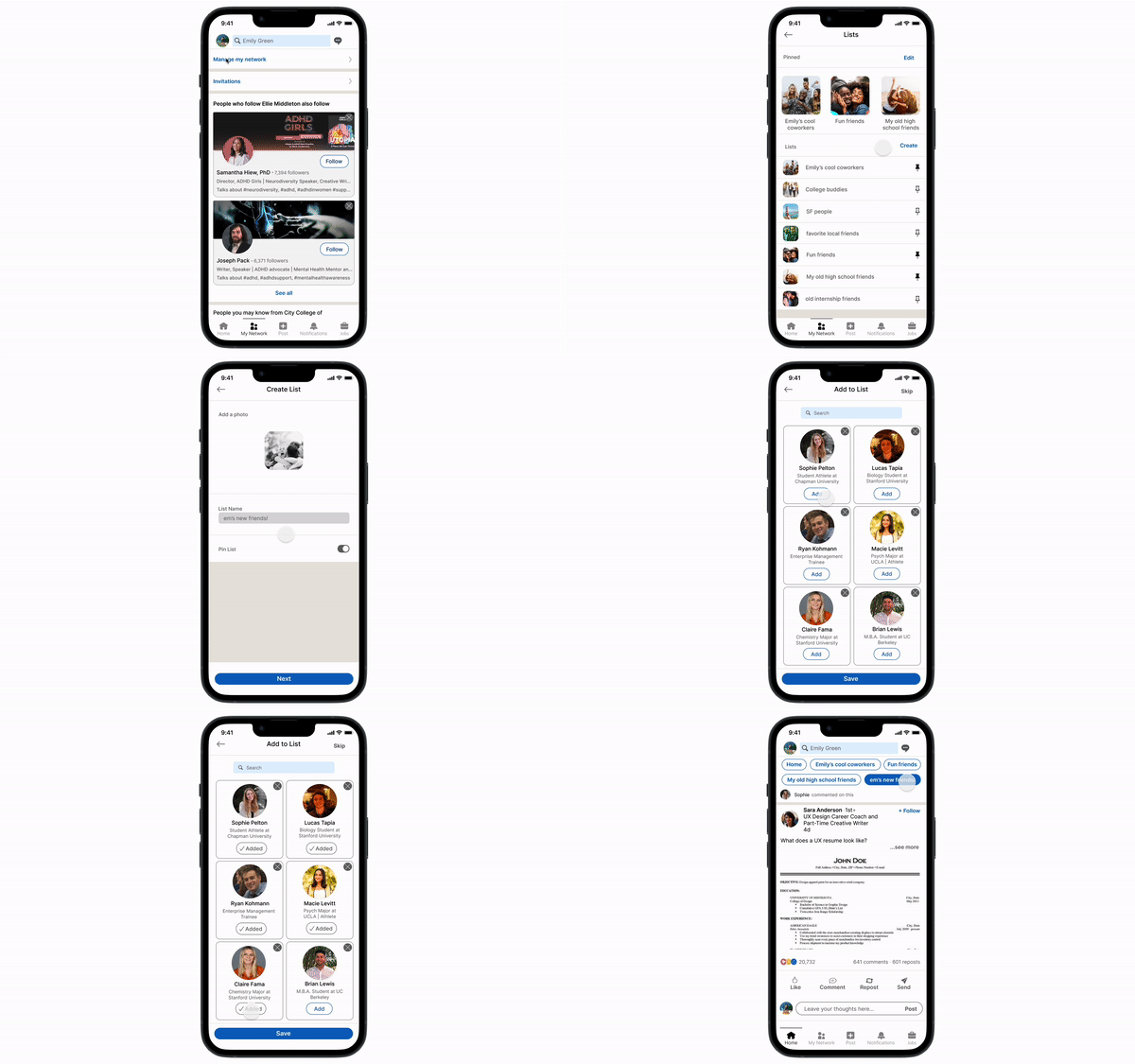
6) Personal Connections List
Users can now organize their connections into lists in order to personalize the posts that are in their feed. For example, users can group their current colleagues in a list and only see updates from them.
Users can now organize their connections into lists in order to personalize the posts that are in their feed. For example, users can group their current colleagues in a list and only see updates from them.
6
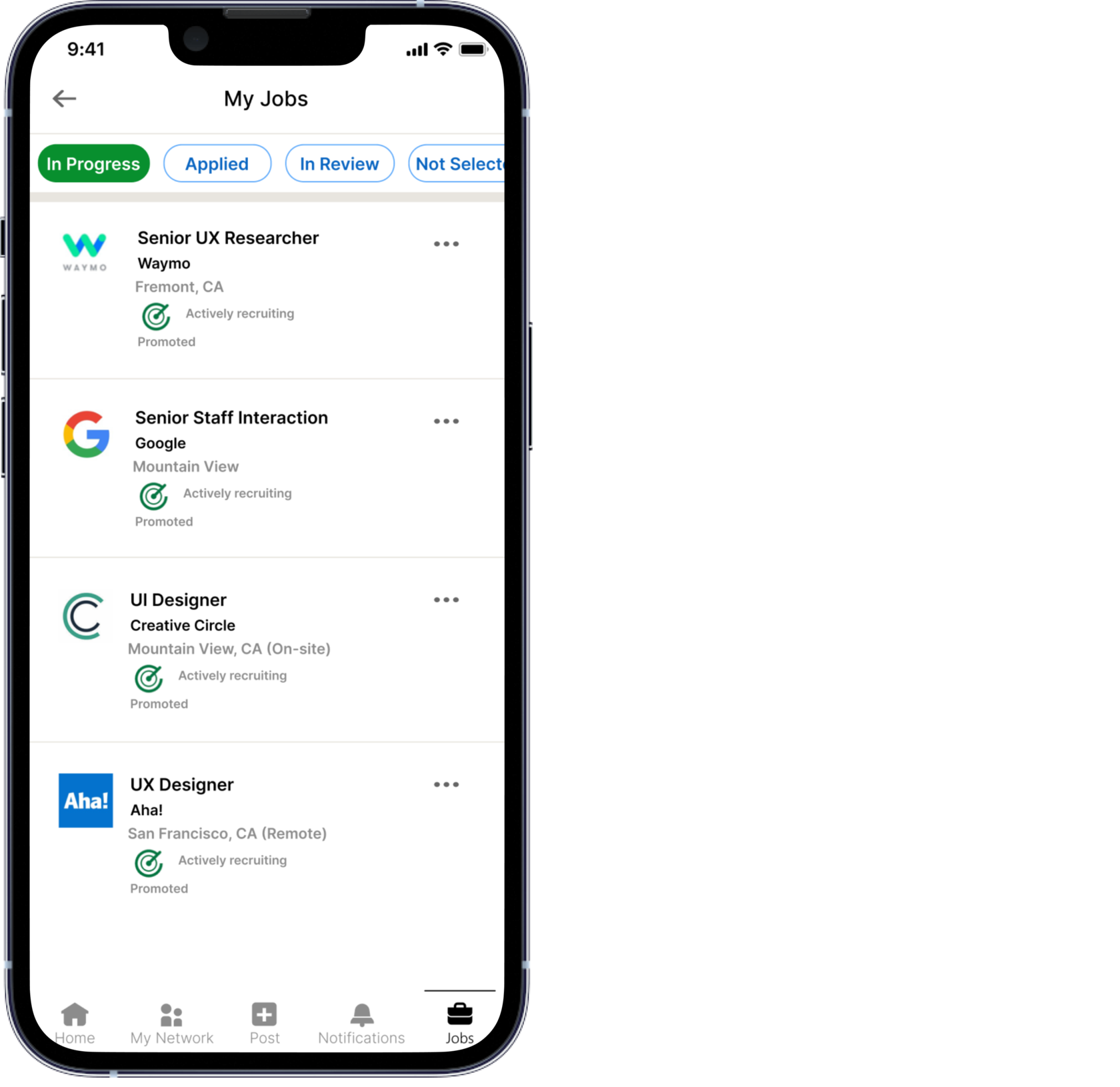
my Jobs
7) My Jobs - Kanban board
Kanban board for job applications tracking.
The ability for users to organize responses to vacancies by different groups such as In Progress, Applied, In Review, Not Selected and Archived.
Kanban board for job applications tracking.
The ability for users to organize responses to vacancies by different groups such as In Progress, Applied, In Review, Not Selected and Archived.
7
Prototype
Finally, my team and I created an interactive prototype.
Let’s take a tour below to view the prototype!
Let’s take a tour below to view the prototype!
TESTIng
Once our wireframes were complete, our team wanted to test our solution with users in order to discover what features work and didn't work as well. To accomplish this, we conducted usability testing with several individuals in order to observe how they interacted with our app. Then we compiled and incorporated as much feedback as we could to iterate on our wireframes. As a result, most individuals thought that the features we added made sense and solved their problems.
Reflection
In the two weeks we've been working on redesigning LinkedIn to address the main problem of the lack of tools for creators, we've added features that provide more ways to showcase user’s work. However, in the course of our work and user requests, we have gone beyond just searching for tools, but also created more useful features that have simplified the use of the app and made the experience even better. Personally, I credit this project to the creation of shocasing places for creatives, the ability to move information in the profile and pin best achievements and projects in the best order for the user. As lead UI Designer for this project, I created a lot of components for my team and made sure our final look of the app was as consistent across pages as possible. This project taught me how to work in a team with people with completely different visions, and it gave me an incredible experience of communication and argumentation about each element of the design. In the future, if I'll have an opportunity to work with LinkedIn again, I would like to work on upload process for projects, creating more tools for creatives, interview calendar, and tools for recruiters.

